Polish & Ship — Brew Log v1
Seventeen lessons of building. One lesson of polish. Then we’re done.
This is the lesson where Brew Log moves from “works on my machine” to “could ship to the App Store tomorrow.” The technical pieces are minor — a few accessibility modifiers, a dark mode pass, a Dynamic Type bound or two. The harder work is the ship checklist: app icon, privacy manifest, App Store assets, TestFlight. We cover both.
By the end of this lesson, Brew Log v1 is a real iOS app. You could install it on your phone and use it. The next time you log a brew while waiting for an espresso to pull, that’s an app you wrote.
Accessibility — VoiceOver done right
Accessibility isn’t a feature you bolt on at the end. SwiftUI does a remarkable amount automatically — every Text is a VoiceOver element, every Button announces its action, every Image with a meaningful name gets read. The work you have to do is clean up over-reading and ambiguity.
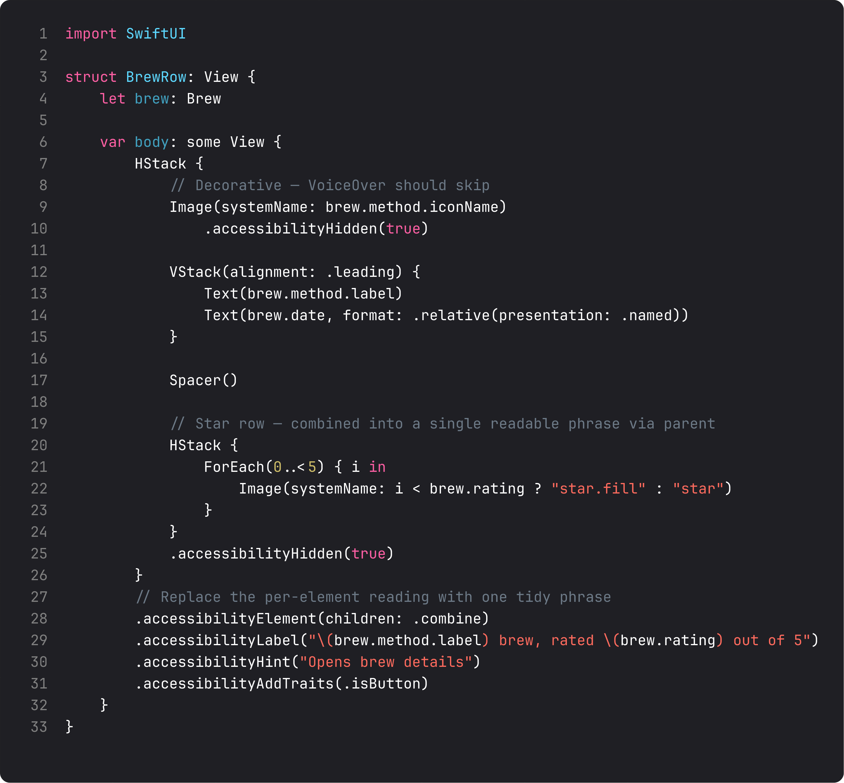
The four modifiers that handle 90% of cases:
.accessibilityHidden(true)— hide decorative elements from VoiceOver. The icon next to the brew method name is decorative — VoiceOver shouldn’t read “cup and saucer fill icon, Espresso.” Hide the icon, leave the text..accessibilityElement(children: .combine)— collapse a complex view (like a row with 5 sub-elements) into a single VoiceOver target. Now swiping through the brew list reads each row as one phrase, not five..accessibilityLabel("...")— replace the auto-generated label with one tidy phrase. We use “Espresso brew, rated 4 out of 5 stars.” instead of the row’s auto-concatenation..accessibilityHint("Opens brew details")— describes what tapping does. VoiceOver reads it after a pause when the element is focused. Use for non-obvious actions.
A common LLM mistake: stacking accessibilityLabel and not hiding the underlying elements. VoiceOver reads everything plus the label — annoying. Hide the parts, label the whole. That’s the pattern.
To test: run on simulator → Accessibility Inspector → enable VoiceOver simulation. Swipe through your screens. If anything reads weirdly, fix it now. Do this once per screen and you’re 95% accessibility-ready.
Dynamic Type — text scales without you doing math
If you used font(.body), font(.headline), font(.largeTitle) etc. throughout the course (we did), Dynamic Type already works. Crank up the system text size in Settings → Display & Brightness, your screens grow.
Two patterns that cover the 5% Dynamic Type doesn’t handle automatically:
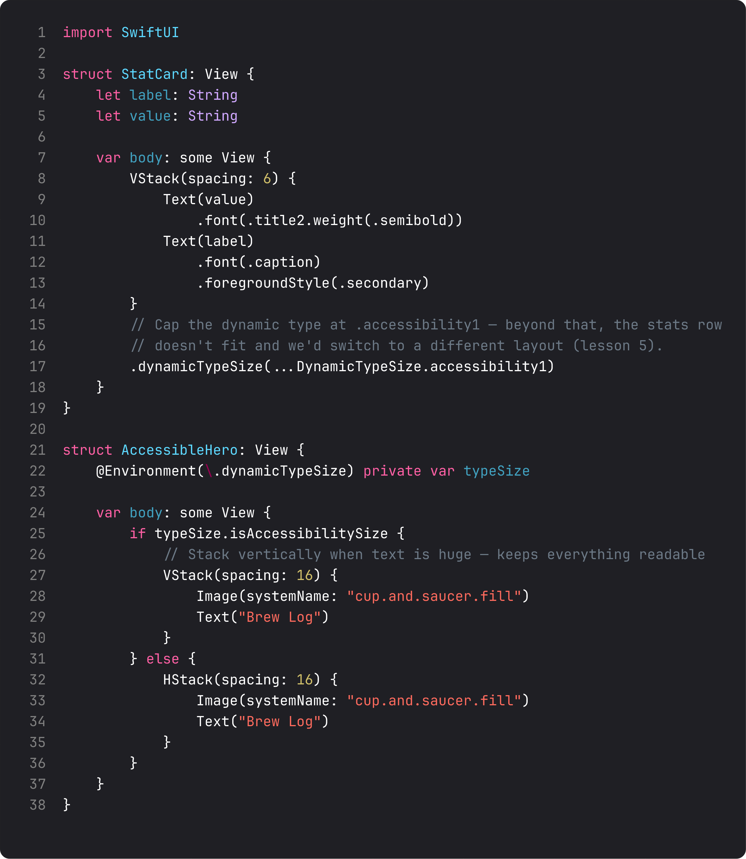
- Bound the type size on tight layouts.
dynamicTypeSize(...DynamicTypeSize.accessibility1)says “respect the user’s preference up to accessibility size 1, then stop.” Useful on stat rows where 5 columns of XXXL text would explode. Don’t ignore the user’s preference entirely — just cap it where layout breaks. - Adapt layout for accessibility sizes. Read
@Environment(\.dynamicTypeSize)andif typeSize.isAccessibilitySize { ... }to switch from a tight horizontal row to a stacked vertical layout. The accessibility-size user gets a single-column experience that’s actually readable; the regular user gets the dense layout.
For Brew Log, the home screen handles up to about .xxLarge cleanly. Above that, the stat row gets cramped — we’d cap it. We don’t need to write the cap right now because everything is still readable; add the cap when you see the breakage in the Accessibility Inspector, not pre-emptively.
Dark mode — almost free, almost
Dark mode “just works” if you’ve been using semantic colors throughout: .foregroundStyle(.primary), .foregroundStyle(.secondary), .tint, .thinMaterial. The system swaps light/dark variants automatically.
The places to actually look:
- Hardcoded
Color.brown,Color.black,Color(red:green:blue:). These don’t adapt. Either use a semantic option (.tint,.primary) or define a color asset inAssets.xcassetsthat has both light and dark values. - Translucent backgrounds over photos.
.thinMaterialadapts..fill(Color.white.opacity(0.5))doesn’t — the white stays white in dark mode and looks wrong. - Custom shadows.
.shadow(color: .black.opacity(0.15), ...)works in light mode but the same shadow in dark mode (already-dark background) is invisible. For shadows that should work in both, use.shadow(color: .primary.opacity(0.05), ...)or set explicit color asset for shadows.
For Brew Log, the only place that needed adjustment was the home gradient — its opacity bumps slightly in dark mode (0.18 vs 0.10) so the tint is still visible against the dark bg. Two values, one ternary, dark mode looks deliberate.
Test mode: flip your Mac’s appearance setting; the simulator follows. Or .preferredColorScheme(.dark) on a preview block. Don’t ship without flipping it at least once per screen.
Preview matrix — every state, in one file
The capstone of any well-built SwiftUI screen is multiple #Preview blocks showing every state. Loaded, empty, error, light, dark, accessibility-large.
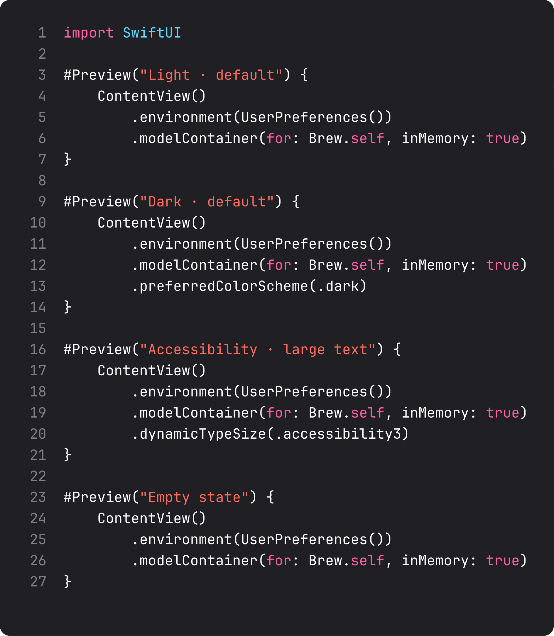
Why this matters: every preview you don’t have is a state you’ll forget to test. And the moment a designer sees a screenshot of accessibility-size text and finds a bug, they’ll send it to you with screenshots. You want those screenshots to be ones you already saw.
For BrewLog v1, every screen should have at least Light + Dark previews. Empty-state and accessibility-size previews on screens that have multiple states. The cost is 8 lines of code, the benefit is catching every state regression at edit time instead of production.
The App Store ship checklist
Brew Log is ready. To actually put it on a phone:
- App icon. Drop a 1024×1024 PNG into
Assets.xcassets / AppIcon.appiconset. SwiftUI/Xcode 26 auto-generates the smaller sizes. Use a flat icon — no transparency, no rounded corners (system applies them). - Bundle identifier. Already set to
pekmario.com.BrewLog. Change to your own domain if you ship to the App Store under your account. - Display name. Set in Info.plist’s
CFBundleDisplayNameif it should differ from the target name. - Privacy manifest (
PrivacyInfo.xcprivacy). Required by Apple for new apps in 2024+. Brew Log uses no tracking APIs and stores everything locally — minimal manifest. - App Store Connect screenshots. 1320×2868 for iPhone Pro Max (iOS 26). At least 3 screenshots per device size. (We’ve been recording them all course — check the
videos/screen.pngfiles in each lesson folder.) - App Store Connect listing. App name, subtitle, keywords, description, category. Brew Log fits “Lifestyle” or “Food & Drink.”
- TestFlight build. Archive → Distribute App → App Store Connect → Wait for processing → invite yourself first → install on your phone → use it for a week → fix what bugs you.
- Submit for review. App Review takes 24–72 hours typically. Plan for at least one bounce — they always find something.
The full submission process is a course of its own. For Brew Log v1, you have everything technical you need.
What changed in BrewLog this lesson
Three small but real polish moves:
BrewRowgot proper VoiceOver semantics. Decorative icons hidden, the row collapses into one element with a tidy label, hint describes the action. Swipe through the recent brews list with VoiceOver enabled — each row reads as one phrase.- The
BrewMethodenum gainedCodable. SwiftData needed it for persistence (added in lesson 17). Free conformance, zero overhead. - The home gradient adapts to dark mode. Opacity bumps from
0.10to0.18whencolorScheme == .dark. Tiny change, visible result.
That’s it. Eight months of work compressed into eighteen lessons. A working, persistent, accessible, multi-tab SwiftUI app, built end-to-end with no AI shortcuts.
What it looks like running
The video walks through the whole app one last time: open Home, log a brew via sheet, see it in the recent list, switch to Settings, scroll through preferences and the Methods grid, switch back. Persistent, accessible, tabbed, themed, ready to ship.
Takeaway — the whole course in one paragraph
Views are values. Body is a function from state to UI. Layout is parent-proposes-child-decides. Modifiers wrap, in order. State for owned, Binding for borrowed, Observable for structured, Environment for shared. List for collections, Form for settings, NavigationStack for hierarchy, TabView for app shells. Sheets for tasks, alerts for confirms. SwiftData for persistence. Accessibility from the start. Get those nine things internalized and you’re a working SwiftUI engineer.
You’ve also got a real app — Brew Log — that you built top-to-bottom. Submit it to TestFlight this weekend. Use it for a week. See what breaks. That’s the loop that turns “I finished a course” into “I ship apps.”
What’s next
Course 1 is done. The next chapter — SwiftUI in Practice — is where we step up to architecture, networking, real APIs, and a working markets-watchlist app called Pulse. We use ABNetworking (the production networking layer we open-sourced after building it for banking apps) and learn the patterns that make a ten-screen app feel like a five-screen app.
Brew Log is a good first app. Pulse is the one that proves you can ship a real product.
See you in Course 2.
NativeFirst Team
EditorialThe NativeFirst team — engineers and designers building native Apple apps and writing the courses we wish we had when we started.
Comments
Leave a comment