Buttons, Menus, and Pickers — The Three Controls You'll Use Every Day
Three controls show up in basically every iOS screen: Button, Menu, and Picker. SwiftUI’s versions of each look great by default, adapt to dark mode and accessibility automatically, and give you just enough customization without becoming a Figma tutorial.
The trick isn’t learning their APIs — it’s learning which one to reach for in a given situation. Use the wrong control and the screen feels off. Use the right one and the screen feels native.
By the end of this lesson, BrewLog has a real primary CTA (“Log a brew”), an overflow menu in the hero, and a method picker in Preferences. Three lines of intent, three different controls.
Buttons — styles, roles, and when each lands
Every Button takes an action closure and a label. What changes the visual is the ButtonStyle and the role.
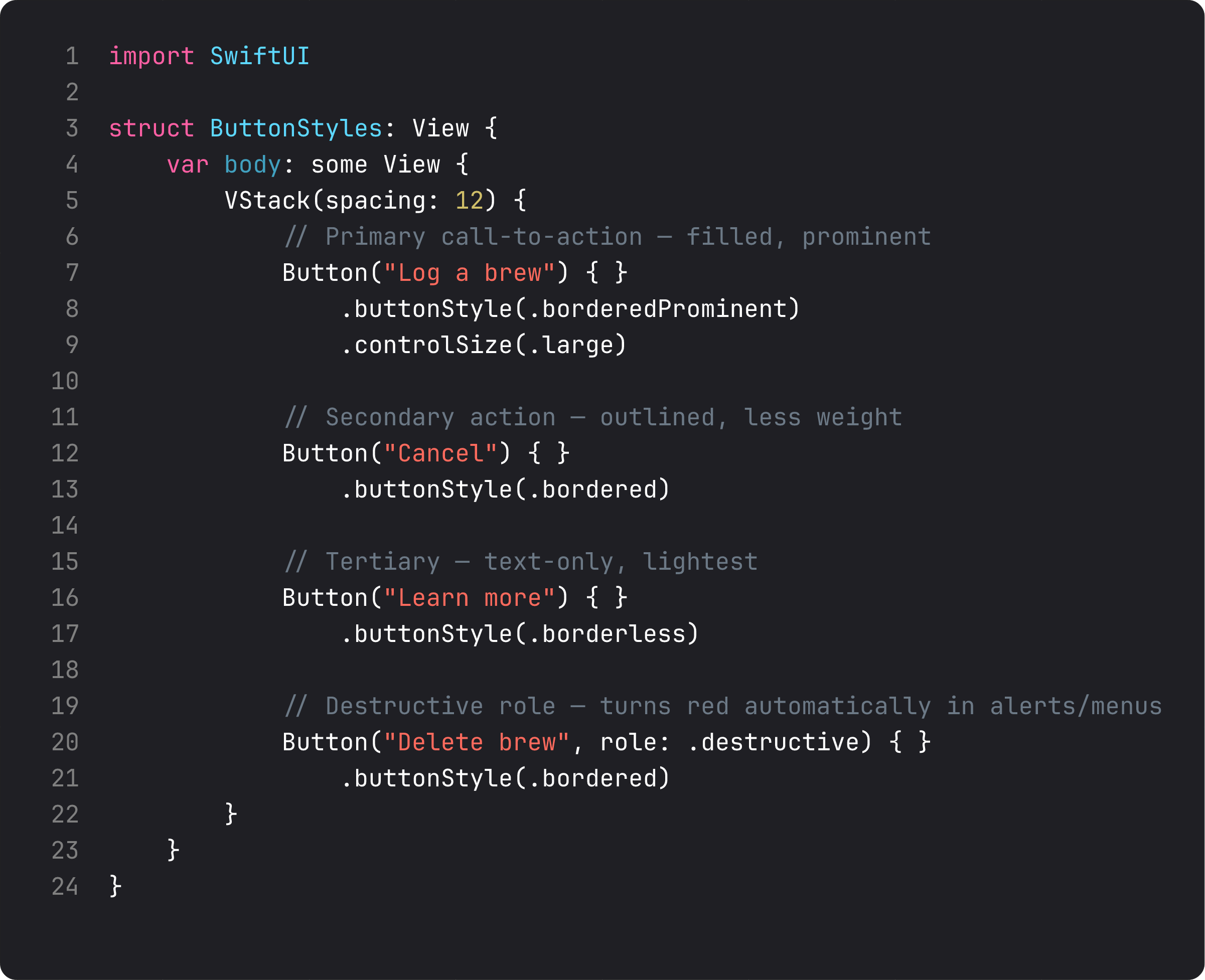
The four built-in styles, ranked by visual weight:
.borderedProminent— solid, accent-tinted. Use for the one main thing the user should do on this screen. Never two on the same screen..bordered— outlined. For secondary or peer actions. Cancel buttons, dismiss buttons, settings buttons..borderless— text-only, accent-colored. For inline actions or tertiary CTAs. The “Learn more” link, the “Forgot password?” hint..plain— fully unstyled. For when the label is the visual (a card that’s tappable, an icon button).
role: .destructive automatically tints the button red in alerts and menus. Do this even if it doesn’t change the visual on this particular screen — the role is metadata that VoiceOver announces, that the system uses to position the button correctly inside an alert (.destructive goes last; .cancel goes apart), and that future versions of iOS may style further. Roles communicate intent. Styles communicate weight. Set both.
Two controlSize values matter in practice: .large (for primary CTAs that should grab attention) and .small (for compact actions inside cards). Default .regular is the iOS standard.
Menu — overflow without the chrome
Menus pack multiple actions behind a single tappable label. They show as either a popup (iOS) or an inline expandable group, with full support for sections, dividers, icons, and roles.
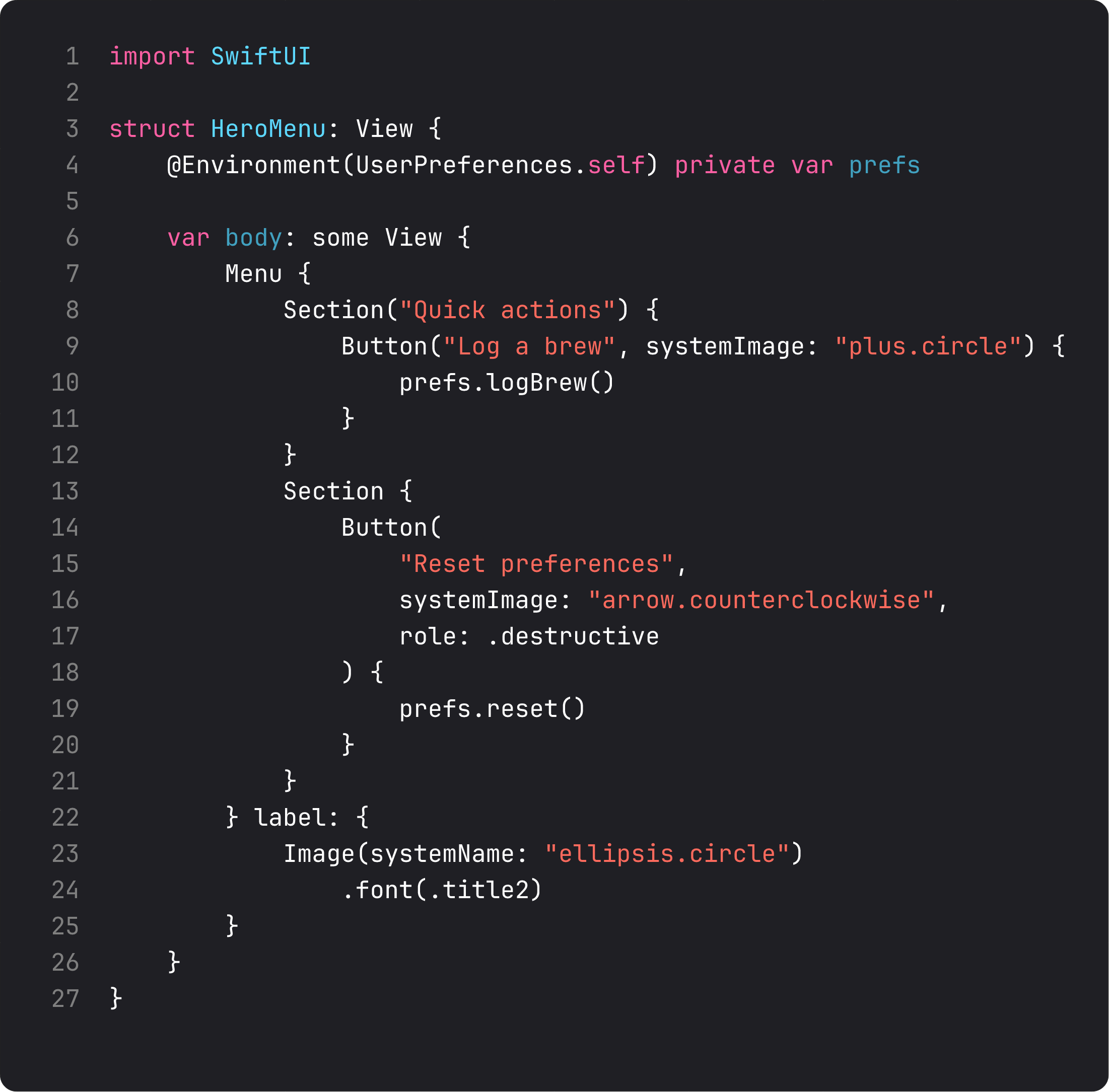
Three details that elevate a Menu from “works” to “feels right”:
- Sections — wrap related items in
Section { ... }. The system draws separators between sections. Group safe actions together, dangerous ones in their own section. systemImage:parameter — every Button in a Menu accepts an SF Symbol. The visual hierarchy comes for free.role: .destructive— destructive items render red. Always. This is the primary place that role pays off visually.
The classic place for a Menu is the overflow location — the ”…” button in the top-right of a list or detail view. Anything that doesn’t earn primary toolbar space goes here. Don’t put your only action in a menu; that’s an extra tap for no reason.
Picker — four styles, one decision tree
A Picker binds to a value and offers a list of options. SwiftUI ships with four built-in pickerStyles, each best for a specific situation.
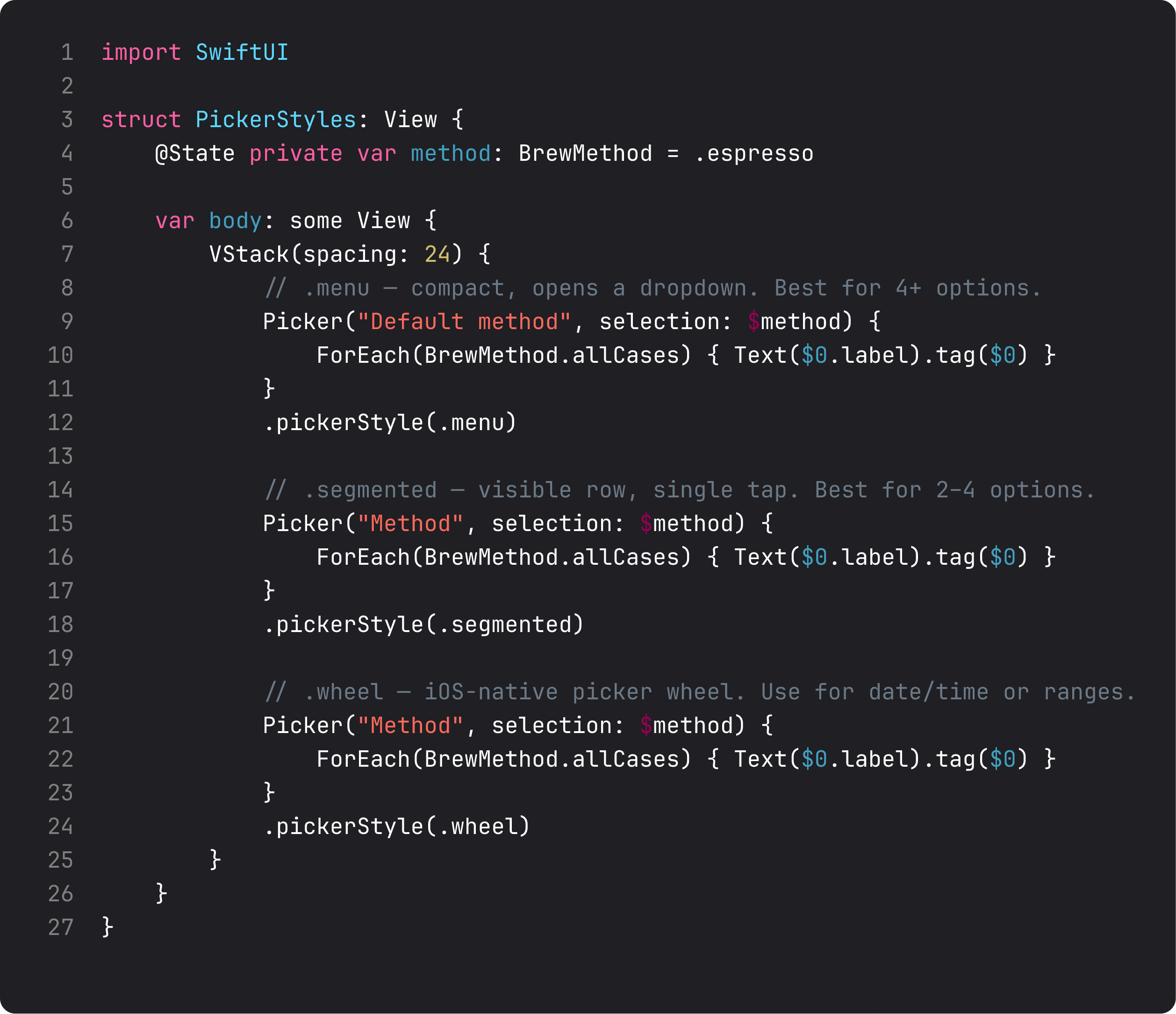
The decision tree:
.menu— compact dropdown. Best when you have 4+ options and they don’t all need to be visible. Default forPickerinside aForm..segmented— visible row of equal segments. Best for 2–4 short options. Don’t use it for 5+ — labels start truncating fast and tap targets shrink. Don’t use it for long labels — same problem..wheel— iOS-style spinner. Best for continuous ranges (years, durations, timezones) or when the user expects a big list (countries). Avoid for 3 options — it’s overkill..inline— every option visible as its own row. Best inside aListorFormwhere you want each option to be tap-targetable individually. We’ll use this in lesson 11 (lists).
For BrewLog’s “Default method” — five enum cases, all short — .menu was the right pick. Compact, idiomatic inside a card.
A trap I see weekly: every action is the primary CTA
The vibe-coded version of any “settings” screen tends to give every button .borderedProminent:
VStack {
    Button("Log a brew") { }.buttonStyle(.borderedProminent)
    Button("View history") { }.buttonStyle(.borderedProminent)
    Button("Share") { }.buttonStyle(.borderedProminent)
    Button("Reset") { }.buttonStyle(.borderedProminent)
}
Four prominent buttons in a row. The user has no idea which one is “the thing.” Visual hierarchy is what tells them where to tap first. One primary, the rest secondary or tertiary.
For BrewLog right now: .borderedProminent for “Log a brew” (the daily action). .bordered for “Reset” (the rare action). The Menu carries everything else. The user’s eye goes straight to the right place.
This is a soft rule, not a law. But once you start applying it, every screen you design feels more decisive.
What it looks like running
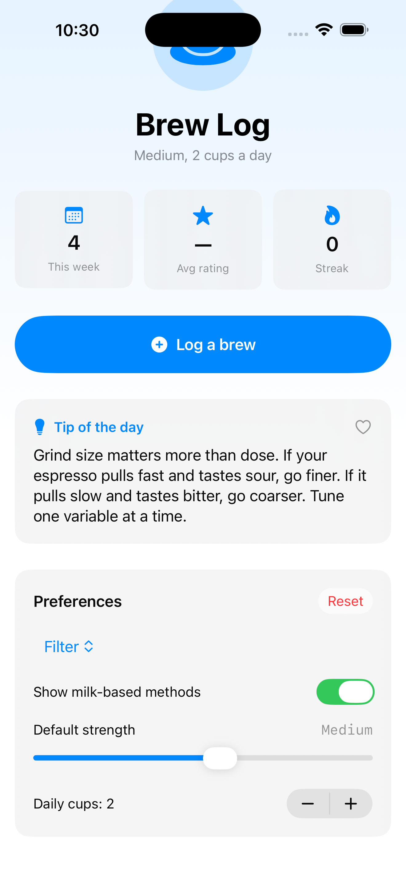
The video walks through three brews logged (“This week” goes 0 → 3), the hero menu opens with two sections, then we swipe down to the Preferences card and switch method from Espresso to Filter through the Menu picker. Three controls covered, real interactions, all wired through the environment we set up last lesson.
Takeaway
Button for actions, Menu for grouped actions or overflow, Picker for choosing one of N. Style controls weight; role controls intent — set both. One primary CTA per screen, the rest in lower visual weights. Pick the picker style by option count and screen real estate.
Three controls down. Six more to go in this module before we touch lists.
Next lesson: Toggle, Slider, Stepper, DatePicker, ColorPicker, ProgressView — the form-control toolbox that handles every input shape between “tap” and “type.”
NativeFirst Team
EditorialThe NativeFirst team — engineers and designers building native Apple apps and writing the courses we wish we had when we started.
Comments
Leave a comment