Stacks and Spacers — Compose Without Nesting Forever
A SwiftUI screen is a tree of views. Stacks are how you grow that tree without losing your mind. There are exactly three of them — VStack, HStack, ZStack — plus one special view called Spacer that does nothing but eat empty space.
That’s the whole layout vocabulary for 80% of screens you’ll ever build. The remaining 20% involves grids, custom layouts, and GeometryReader — we’ll touch those in lesson 5. For now: three stacks and a spacer.
By the end of this lesson, BrewLog has a stats row with three side-by-side cards beneath the greeting card. The component is small, but it’s a real-world layout pattern you’ll repeat constantly.
The three stacks, side by side
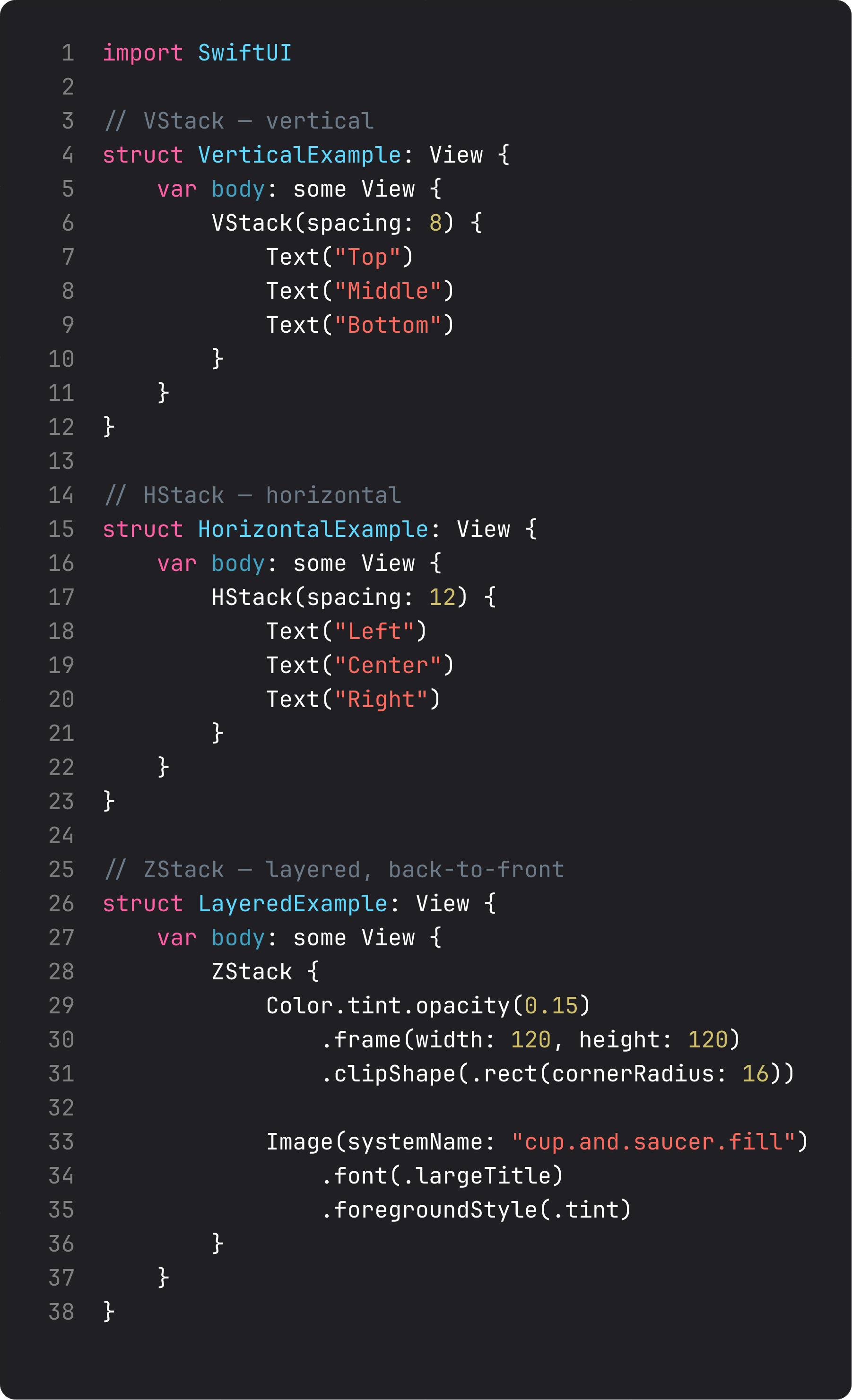
Read those three views top to bottom and you have the SwiftUI layout system in three sentences:
VStackstacks children vertically, top to bottom. Default alignment is.centerhorizontally.HStackstacks children horizontally, leading to trailing. Default alignment is.centervertically.ZStackstacks children in layers, back to front. The first child is at the bottom of the pile, the last child is on top.
spacing: controls the gap between children. alignment: controls how children line up on the cross-axis. That’s it. There’s no auto-layout system to fight, no constraints to break.
Real-life analogy: think of a VStack like a stack of pancakes, an HStack like books on a shelf, a ZStack like sticky notes on a fridge. The structure tells the framework where to put each child without you specifying coordinates.
Spacer — the layout tool nobody explains properly
Spacer is a view. That sounds dumb, but it’s the key insight. Spacer is a view whose entire job is to grow as large as possible in the direction of its parent stack and push everything else.
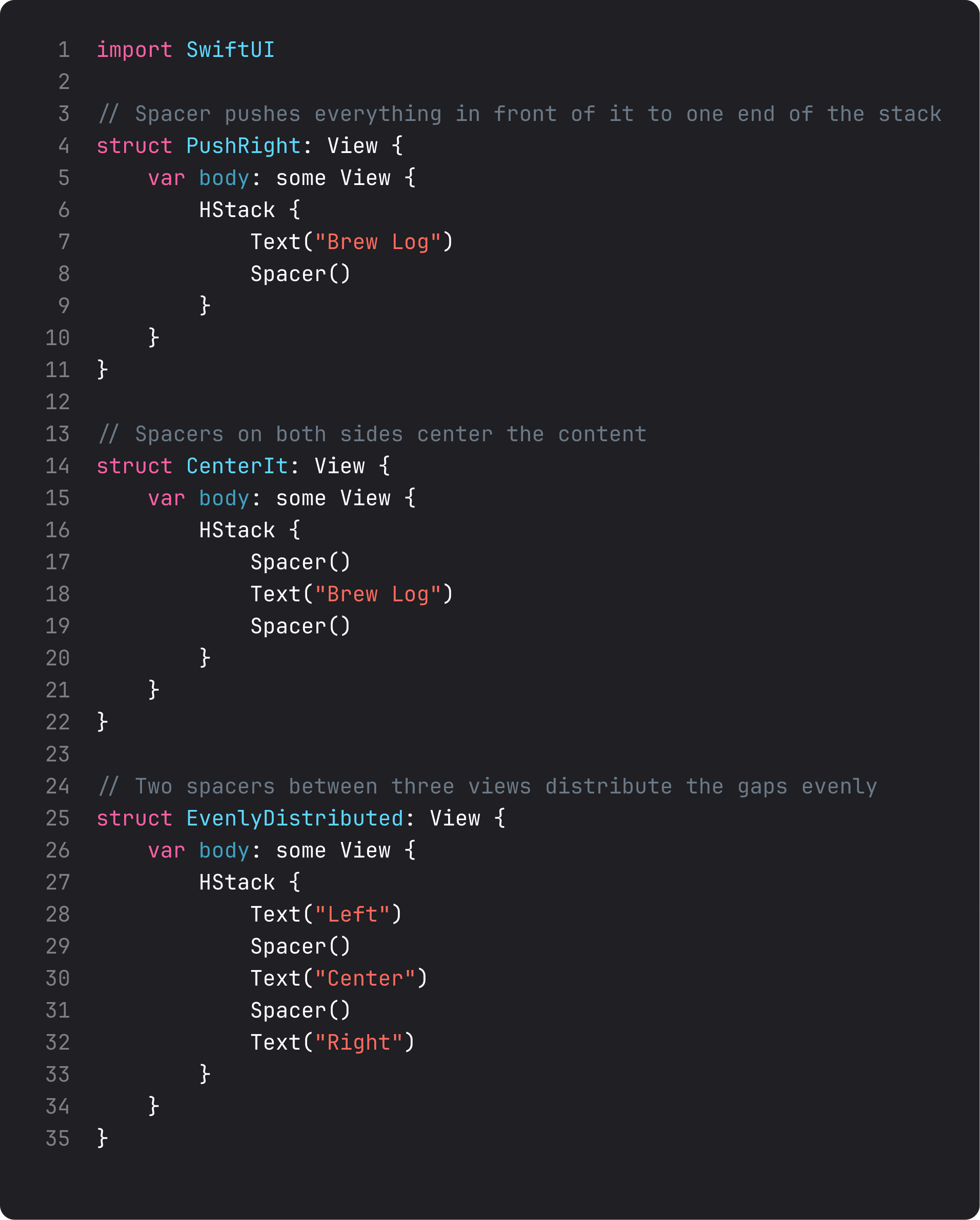
Three positions, three results:
- Spacer at the end — pushes “Brew Log” all the way to the leading edge. Standard “left-aligned in a row” pattern.
- Spacers on both sides — squeezes the content into the middle. This is how you center one item in a row.
- Spacers between items — distributes them evenly. Three items, two spacers, equal gaps.
The mental model: a Spacer says “I will take whatever space you have left after laying out everyone else.” Two Spacers in the same stack split that leftover space equally. Three split it three ways. And so on.
This is much more flexible than alignment options. With Spacer, you’re not asking the stack “where do I want this child” — you’re describing a layout in terms of the gaps you want.
A trap: nesting yourself into a parking lot
Once you know stacks, the temptation is to solve every layout problem by adding more stacks. After two months of building this way, your view files start to look like this:
VStack {
    HStack {
        VStack {
            HStack {
                VStack {
                    Text("Hello")
                }
            }
        }
    }
}
I’m not exaggerating. I’ve reviewed code that goes nine stacks deep to put a label next to an icon. The LLM-generated version is even worse — it adds Spacers at every level “just to be safe.”
Two heuristics that keep this in check:
- If you have three nested stacks of the same direction, stop and re-think. Three nested
VStacks usually mean two of them should be flattened into one stack with properspacing:. - If you have a stack inside a stack inside a stack, extract the innermost into a named sub-view. That’s literally SOLID’s Single Responsibility Principle applied to views: each view does one thing, named after what it does. We’ll do this in BrewLog right now.
This refactor — small named views — is the single highest-leverage move in any growing SwiftUI codebase. Components compose; nesting accumulates.
Building the stats row
Here’s the layout pattern we add to BrewLog: three small cards in a row, each showing a single stat.
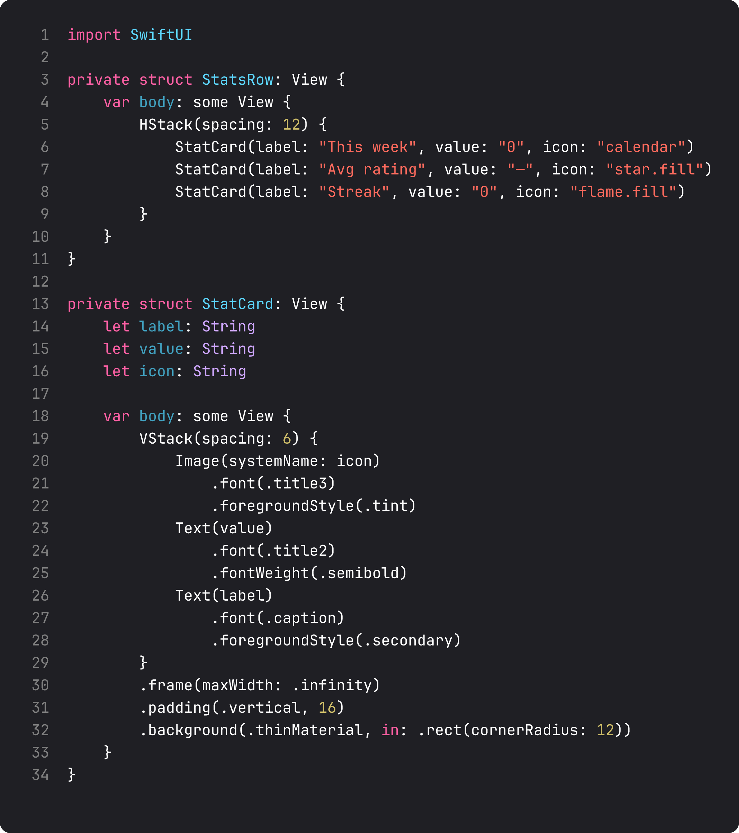
Three things to notice:
StatsRowis its own view. It’s three lines of body. Could it have lived insideContentView? Yes. But naming it makes the layout intent obvious: “row of stat cards.” Future-you (or an AI assistant) readsContentView.bodyand instantly knows what’s there.StatCardis its own view too. Reusable. Tomorrow we add a fourth stat. We pass new params, not write a new layout..frame(maxWidth: .infinity). This is the trick that makes three cards split a row equally. Each card grows to fill its share. NoGeometryReader, no math.
The .background(.thinMaterial, in: .rect(cornerRadius: 12)) modifier is doing real work too. thinMaterial is a system blur-and-tint effect that adapts to dark mode automatically. The in: shape parameter clips the background to a rounded rectangle. That’s a card style in one line. No custom shape, no opacity tuning, no shadow chain.
Then in ContentView, the whole composition is:
VStack(spacing: 32) {
    HeroCard()
    StatsRow()
    Spacer()
}
.padding()
Five lines that describe an entire screen layout. The Spacer() at the end pushes the hero and stats to the top so they don’t float in the middle.
A trap I see weekly
This is the LLM-generated version of the same screen:
VStack {
    Spacer()
    HStack {
        Spacer()
        VStack {
            // hero stuff
        }
        Spacer()
    }
    Spacer()
    HStack {
        VStack {
            // stat 1
        }
        Spacer()
        VStack {
            // stat 2
        }
        Spacer()
        VStack {
            // stat 3
        }
    }
    Spacer()
}
.padding()
What’s wrong here:
- Spacers used as a centering crutch.
VStackalready centers its children horizontally by default. The outerHStackwith twoSpacers wrapping the hero is the LLM equivalent of “I’m not sure how stacks work, let me throw spacers around it.” - No extracted sub-views. Everything is inlined, which means changing the stat card style touches three identical pieces of code instead of one.
- No
frame(maxWidth: .infinity). So when stats have different label lengths ("This week"vs"Best brew"), the cards don’t line up — they grow to fit their content, and the row looks broken.
This generates code that runs, but a reviewer would send it back. Same outcome on screen, three times the maintenance cost.
What it looks like running

Three cards in an HStack, each with a VStack inside. The hero gets a VStack with a ZStack-style cup-on-a-circle (we did that in lesson 3 with .background(.tint.opacity(0.15), in: .circle) — same idea). All four stack types in one screen, no nesting deeper than two levels.
This is a real layout. We could ship this look and nobody would call it “demo code.”
Takeaway
VStack, HStack, ZStack, Spacer — that’s your layout toolkit. Nesting is the cost; named sub-views are how you pay it down. Three same-direction stacks deep is the warning sign — extract before you keep going.
Layout in SwiftUI isn’t about positioning pixels. It’s about composing small views, each named for what it does, into bigger ones.
Next lesson: the layout protocol itself — parent proposes, child decides — and why that mental model makes 90% of SwiftUI layout problems trivial to debug.
NativeFirst Team
EditorialThe NativeFirst team — engineers and designers building native Apple apps and writing the courses we wish we had when we started.
Comments
Leave a comment