Sheets, Alerts, Popovers, and Confirmation Dialogs
Push isn’t always the right answer. Some things need to interrupt — confirm a destructive action, capture a focused task, show inline context that doesn’t deserve a whole screen. SwiftUI ships four overlay modifiers for exactly these cases: .sheet, .fullScreenCover, .alert, .confirmationDialog, plus .popover for iPad/Mac.
Picking the right one is mostly about reading the situation. We covered the “sheet vs push” question last lesson; this one extends it to the rest of the family.
By the end of this lesson, BrewLog has a proper compose sheet (with medium/large detents and a Save toolbar button), a confirmation dialog when deleting a brew, and an alert when resetting preferences.
Sheet — the modal task container
Sheets slide up from the bottom, dim the underlying view, and offer a swipe-down to dismiss. Use them for modal tasks: composing, editing, configuring something specific.
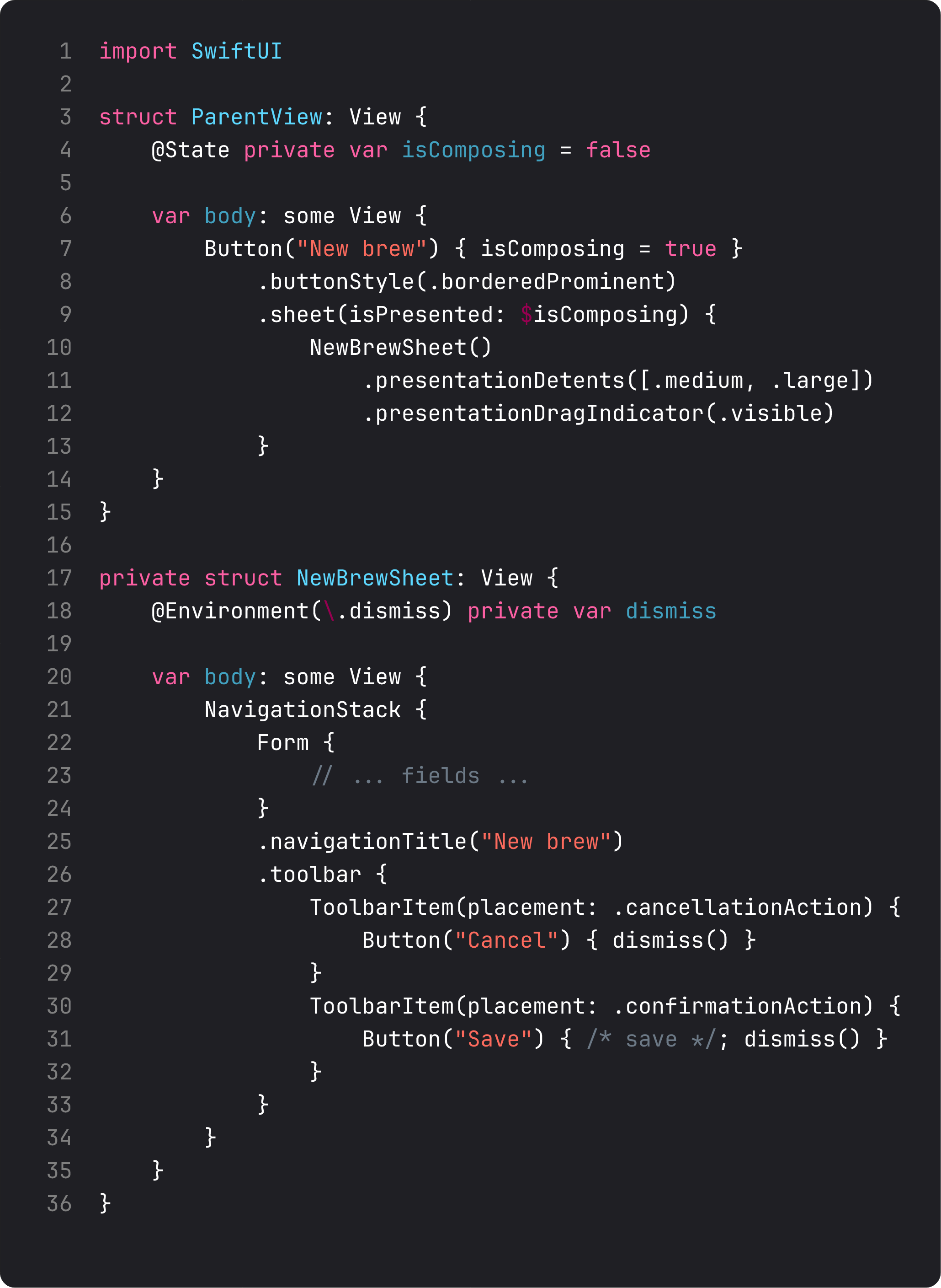
The four modifiers that turn “boring sheet” into “Apple-tier polish”:
.presentationDetents([.medium, .large])— the sheet snaps to half-height first, full-height when dragged. Use.mediumfor quick tasks,.largefor forms with many fields,.fraction(0.4)or.height(300)for custom heights..presentationDragIndicator(.visible)— shows the small grabber bar at the top. Signals “you can drag me.” Hidden by default; turn it on when you have multiple detents.- The sheet’s content is its own NavigationStack — gives you a toolbar with Cancel/Save buttons. The placement names are semantic:
.cancellationAction,.confirmationAction. Don’t hardcode left/right — Apple may swap based on locale. @Environment(\.dismiss)— the sheet’s own dismiss action. Call it from Save and Cancel, not directly via the parent’sisPresentedbinding. The sheet shouldn’t know who’s presenting it. DIP again — every modal flow benefits from this decoupling.
.fullScreenCover is the same thing but covers the entire screen with no swipe-down dismiss. Use it for:
- Onboarding (you don’t want users to peek-dismiss it accidentally)
- Video / camera takeover
- Anything where the user must complete or explicitly cancel
For BrewLog, compose is a .sheet — a swipe-down dismiss is fine; not everything needs a forced flow.
ConfirmationDialog — destructive actions, the Apple way
When a tap deletes data, don’t delete on tap. Confirm. SwiftUI’s confirmationDialog is the system-styled “are you sure?” with proper destructive role and an automatic Cancel button.
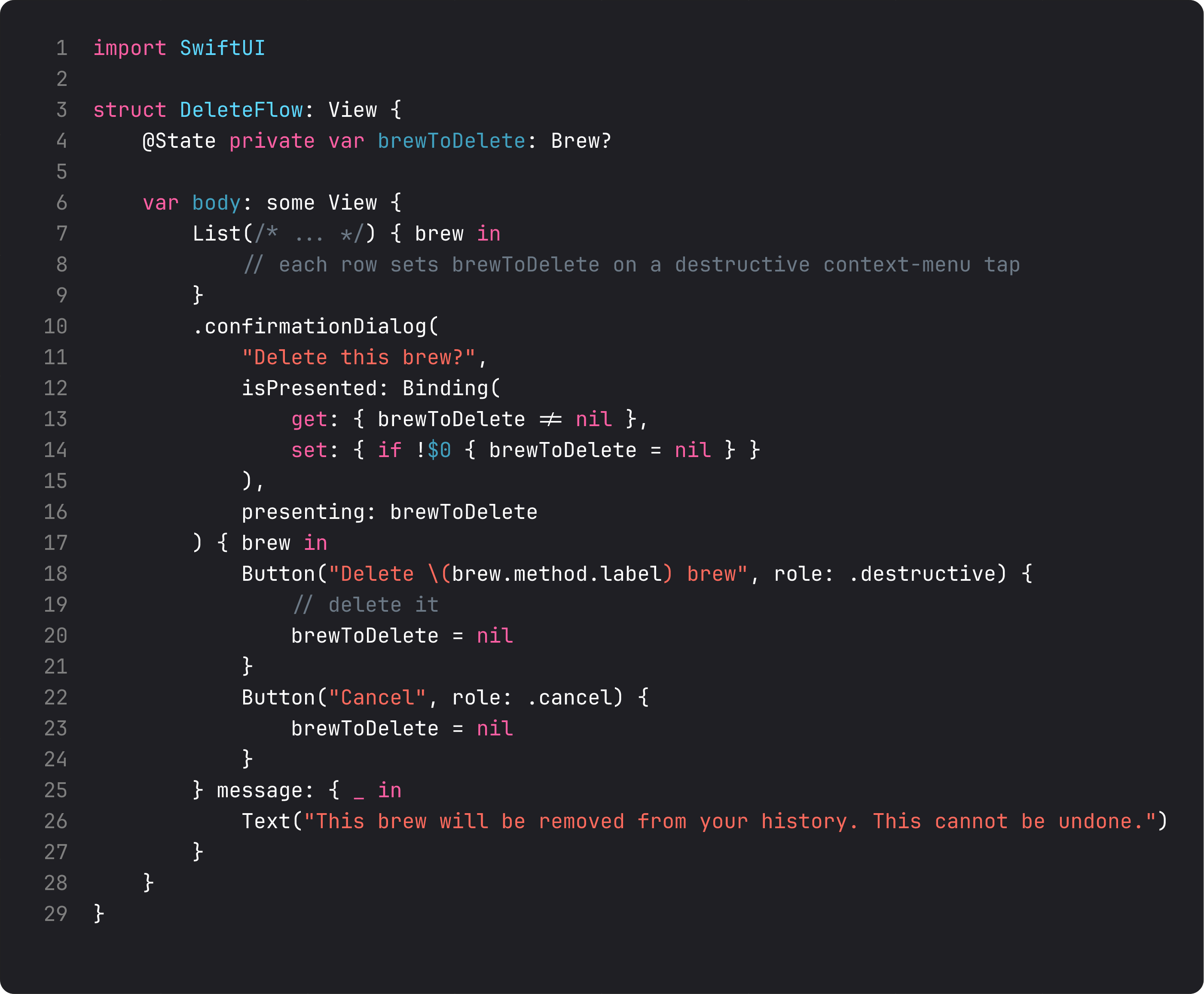
The pattern with presenting: is the one to memorize. Two pieces of state work together:
@State var brewToDelete: Brew?—nilmeans “no dialog showing”; non-nil means “showing a dialog about this brew.”presenting:— passes the value into the actions and message closures. The button label can interpolate fields from the actual brew ("Delete \(brew.method.label) brew"), making the prompt specific.
The Binding(get:set:) adapter is needed because confirmationDialog wants a Binding<Bool> for isPresented:. We derive the bool from “is the optional non-nil” and clear the optional when the bool flips to false. Apple has been promising a cleaner overload that takes Binding<Item?> directly for years; until then, this 4-line adapter is the idiom.
On iPhone, confirmationDialog renders as an action sheet from the bottom. On iPad, it renders as a popover anchored to the source. Same code, two locations — accessibility-correct on both.
Alert — the simpler “are you sure” + message
.alert is the classic centered prompt with title, message, and 1–3 buttons. Use it for:
- Yes/no questions where the answer changes app state (“Reset preferences?”)
- One-shot info (“Failed to load: try again later”)
- Confirmation of background actions
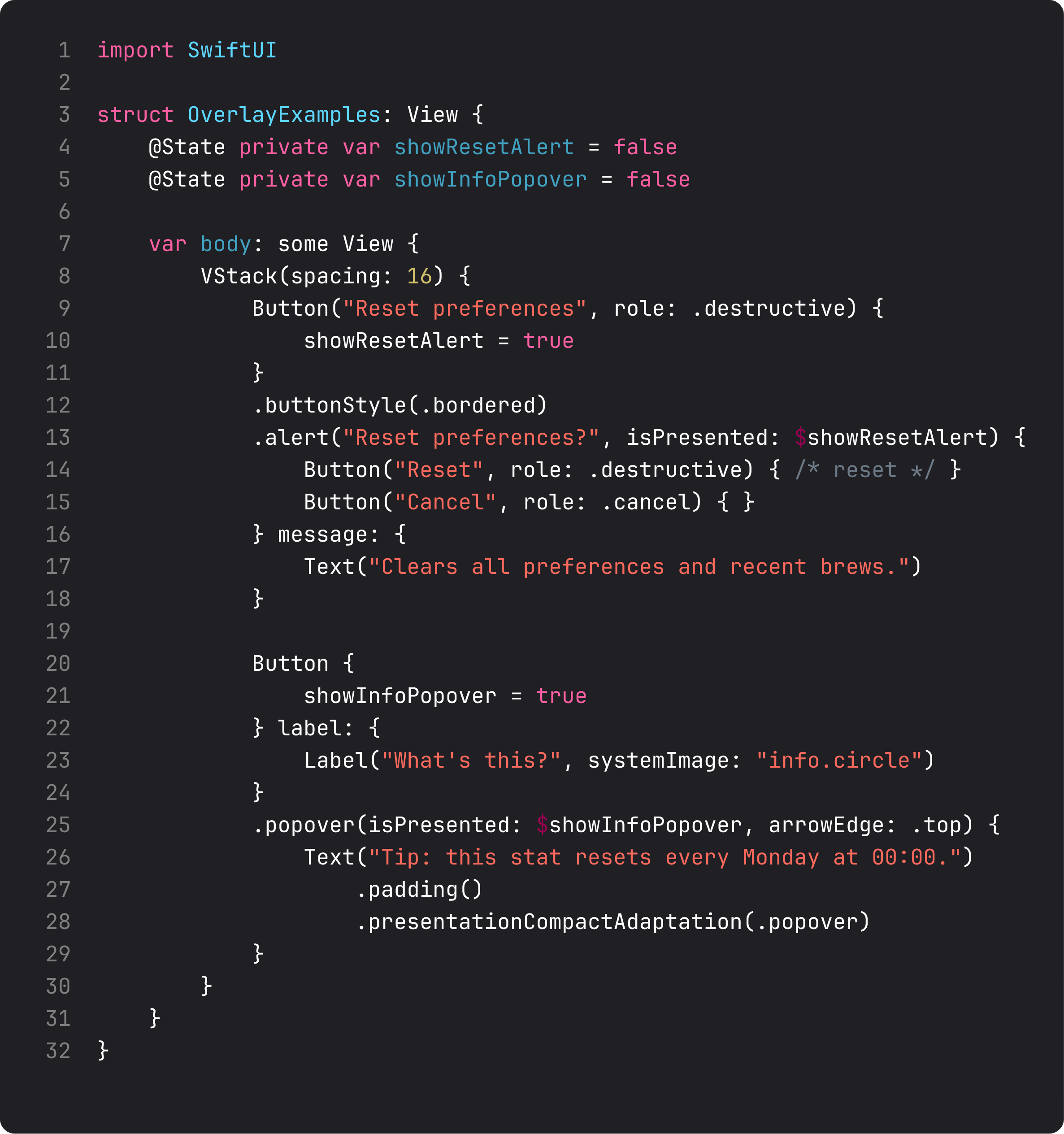
.alert wants two things: a title (the question) and a message: closure (the explanation). Buttons go in the trailing closure. Roles matter — .destructive makes the action red, .cancel aligns it as the default Cancel button.
.popover is the lightweight inline overlay. On iPad and Mac it renders as a true arrow-pointing popover; on iPhone it falls back to a sheet by default. Use .presentationCompactAdaptation(.popover) to force popover behavior on iPhone too — useful for tooltips that should never be a full sheet.
Decision tree for the whole overlay family:
- Single yes/no with info text →
.alert - Single destructive confirmation that needs specifics (“delete this thing”) →
.confirmationDialogwithpresenting: - A task with form →
.sheetwith detents - A forced flow that can’t be peek-dismissed →
.fullScreenCover - A tooltip / inline context →
.popoverwith compact adaptation
Stop reaching for .sheet for everything. Each of these has its place.
A trap I see weekly: deleting on tap, no confirmation
The vibe-coded delete flow:
ForEach(brews) { brew in
    BrewRow(brew: brew)
        .contextMenu {
            Button("Delete", role: .destructive) {
                prefs.deleteBrew(brew)   // ← gone, no confirmation
            }
        }
}
Two clicks (long-press, then tap) and the user’s data is gone. Worse, the LLM-generated version sometimes attaches the destructive action to the primary tap, so a stray finger deletes a row.
The fix is the pattern in this lesson: collect the value into brewToDelete, present confirmationDialog, do the work only when the destructive button is tapped. Apple’s own apps universally do this for any user-data deletion. Confirm any action that destroys user-visible state.
What it looks like running
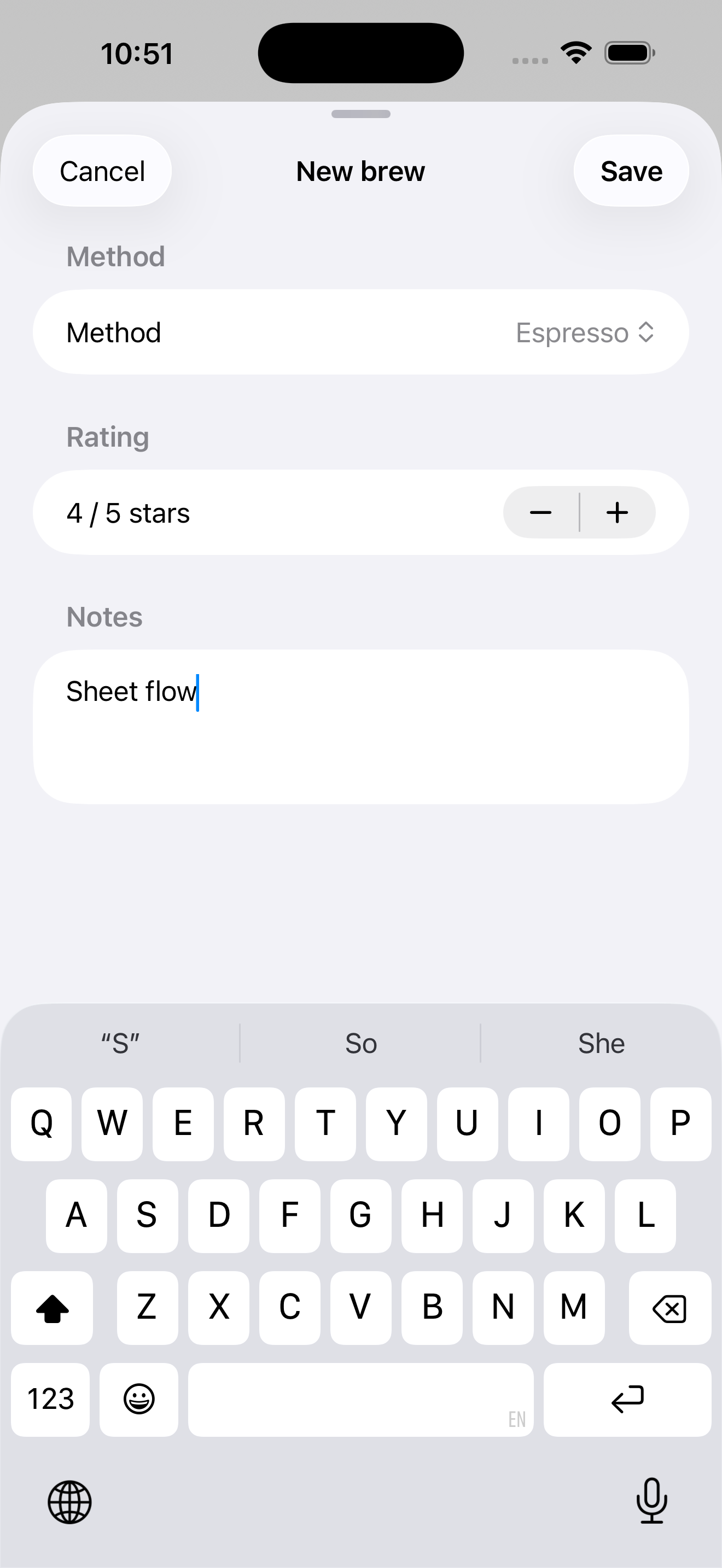
The video taps the new ”+” toolbar button (top-right of the nav bar), the sheet slides up to medium height with the compose form. Type notes, tap Save → sheet dismisses, brew appears at the top of the recent list. Then we scroll down to Preferences, tap “Reset” → alert appears with destructive Reset and Cancel buttons → tap Cancel → alert dismisses.
Three different overlays, each fitting the situation. Replace any of them with the wrong one (a sheet for the reset alert, a push for the compose flow) and the app immediately feels off.
Takeaway
Sheets for tasks, alerts for yes/no with explanation, confirmationDialog for destructive item-specific confirmations, popovers for inline context, fullScreenCover for forced flows. Use presentationDetents and the drag indicator to make sheets feel like 2026 iOS, not 2018 iOS. Always confirm destructive actions before doing them.
Next lesson: shapes, gradients, materials, and the everyday visual-effect modifiers — .blur, .shadow, .opacity. We add the small visual touches that take BrewLog from “shipped on Saturday” to “looks like a real app.”
NativeFirst Team
EditorialThe NativeFirst team — engineers and designers building native Apple apps and writing the courses we wish we had when we started.
Comments
Leave a comment