Layout, Scrolling, and the Modifiers Everyone Underestimates
If there’s one thing that turns SwiftUI from “magical” to “predictable,” it’s understanding how layout works. And the rule is just one sentence long: parent proposes a size, child decides what to do with it.
That sentence sits behind every layout question you’ll ever ask in SwiftUI. Why is my Text getting truncated? The parent didn’t propose enough width and the child accepted. Why does my VStack take the whole screen? Because something in it said “I’ll take whatever you offer, infinity if you have it.” Why does the gradient stop at the safe area? Because the safe area inset is what got proposed.
Once you read screens through this lens, layout debugging stops feeling like guessing.
This lesson also covers ScrollView (so BrewLog finally scrolls), the frame modifier in all its useful forms, the difference between .background and .overlay, and ignoresSafeArea for that polished gradient-behind-the-status-bar look.
Parent proposes, child decides
Every view in SwiftUI gets handed a ProposedViewSize from its parent — basically: “here’s how much space I’m offering you, take what you need.” The child then returns a size that fits its content, which the parent honors.
Some views are happy with whatever they get (Color, Spacer, anything .frame(maxWidth: .infinity)). Others have an intrinsic size and ignore the proposal beyond that (Text with no width constraint will only take what its content needs, then start truncating).
Most layout bugs come from a parent that’s not proposing enough, or a child that’s not accepting what it’s offered. The frame modifier is how you control both sides of that conversation.
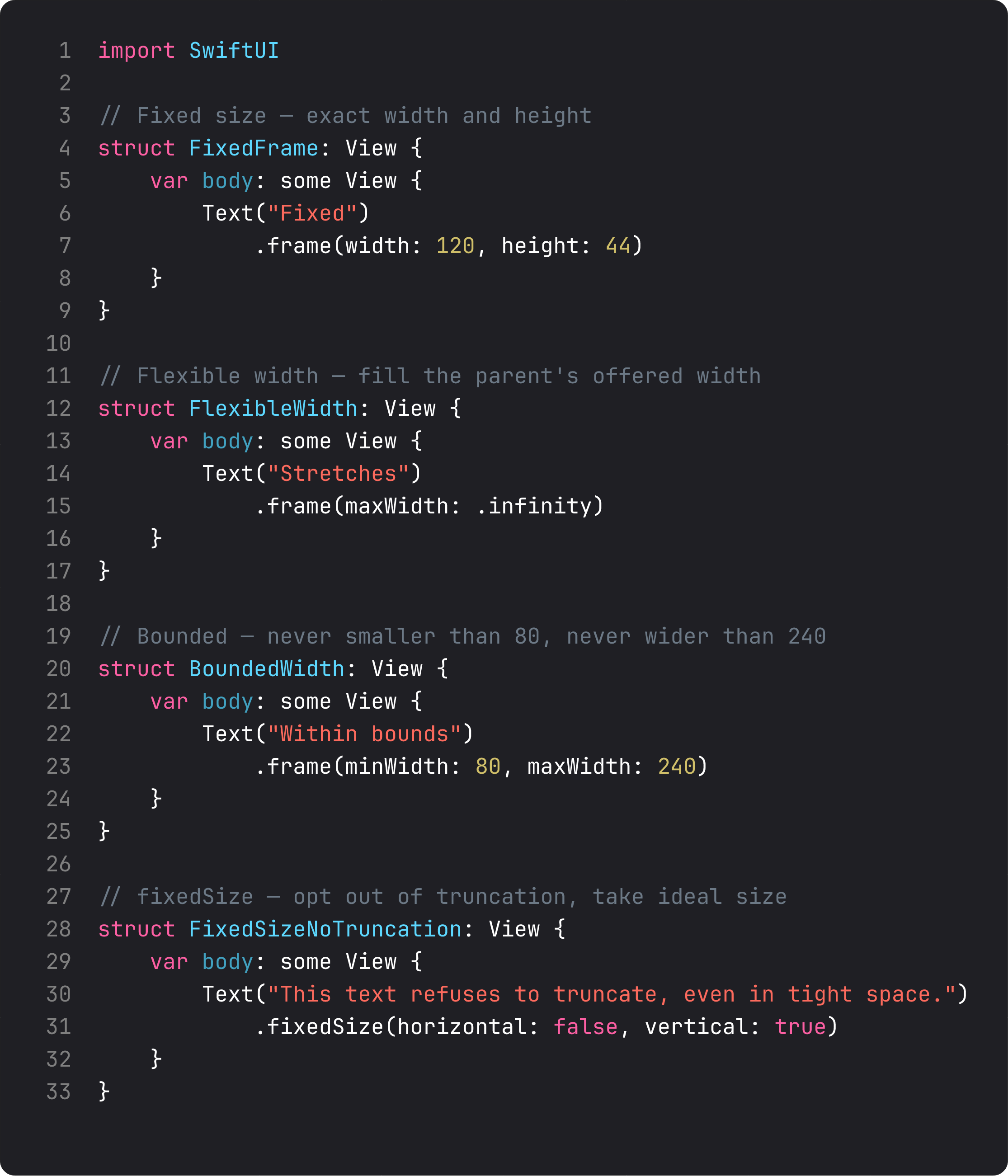
Read those four little views top-down:
- Fixed — exact width and height. Useful for buttons or icons of a known size. Be careful: the content inside has to fit, or it gets truncated.
- Flexible width —
.frame(maxWidth: .infinity). The view expands to fill whatever the parent offers horizontally. This is the trick that made ourStatCards split a row equally last lesson. - Bounded — minimum and maximum widths. The view stays within bounds regardless of content. Useful for cards that should look consistent across short and long titles.
fixedSize(horizontal:vertical:)— opt-out of truncation. Tells the view “ignore the proposal in this direction, take your ideal size instead.” If you’ve ever had a Text inexplicably show ”…” in a tight space,.fixedSize(horizontal: false, vertical: true)is the fix.
frame is the most overused modifier in SwiftUI. The trick is to use it only when the default proposal-and-decision dance isn’t doing what you want.
ScrollView and the safe area trick
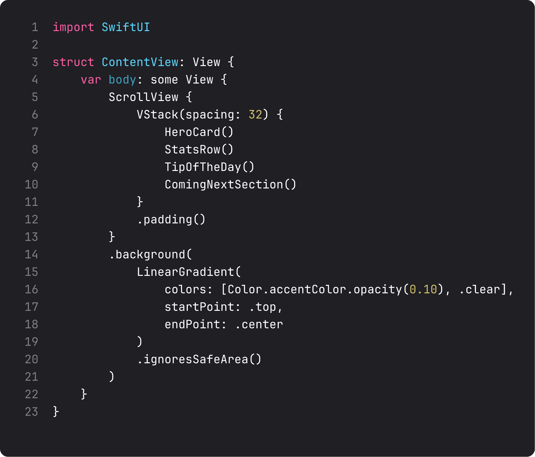
Until this lesson BrewLog has fit on screen by accident — there isn’t enough content yet for it to overflow. That changes the moment we add a “Coming next” section. Time to wrap the whole thing in a ScrollView.
Two things are doing real work here.
ScrollView { ... } wraps your content and gives it scrolling behavior when it overflows. By default it scrolls vertically — there’s a .horizontal axis option if you need it. Inside, you put the same VStack you’d have used otherwise. SwiftUI handles bounce, indicators, and momentum. You handle nothing.
.background(LinearGradient(...).ignoresSafeArea()) is the polish move. By default, every SwiftUI view respects the safe area — content stays out from under the notch, dynamic island, and home indicator. The .ignoresSafeArea() modifier tells the gradient (and only the gradient) “ignore that, paint edge to edge.” The content above stays inside the safe area; the gradient flows behind everything.
This is the pattern for hero gradients, full-bleed photos, and translucent navigation backgrounds. Apply ignoresSafeArea to the background layer, not to the content. Mixing them up is one of the most common SwiftUI mistakes — your title ends up under the notch and the screen looks broken.
.background vs .overlay — they look the same, they aren’t
This is the kind of subtle distinction that makes interviews hard and codebases inconsistent.
// background — paints behind the view
Image(systemName: "cup.and.saucer.fill")
    .background(.thinMaterial, in: .circle)

// overlay — paints on top of the view
Image(systemName: "cup.and.saucer.fill")
    .overlay(alignment: .topTrailing) {
        Circle()
            .fill(.red)
            .frame(width: 10, height: 10)
    }
Both wrap the receiver. The difference is the paint order: background goes behind, overlay goes in front. Choose based on intent:
.backgroundfor fills, materials, gradients — anything that’s the “canvas” the content sits on..overlayfor badges, decorations, “tap me” indicators — anything that should be visually above the content.
Both accept an alignment parameter (.topTrailing for the classic notification badge, .bottomLeading for a footer corner mark). Both can take a shape (in: .circle, in: .rect(cornerRadius: 12)) when paired with a ShapeStyle. The shape clips the layer, which is how you get the soft tinted circle behind our coffee icon — no Circle() view needed.
The visual rule of thumb: if removing it would expose nothing, it’s a background. If removing it would expose your content, it’s an overlay.
The TipOfTheDay card: leading alignment and frame(maxWidth:.infinity, alignment:)
Last lesson we used .frame(maxWidth: .infinity) to make StatCards share a row equally. That same trick has a less obvious second use: forcing left-aligned content inside a flexible-width view.
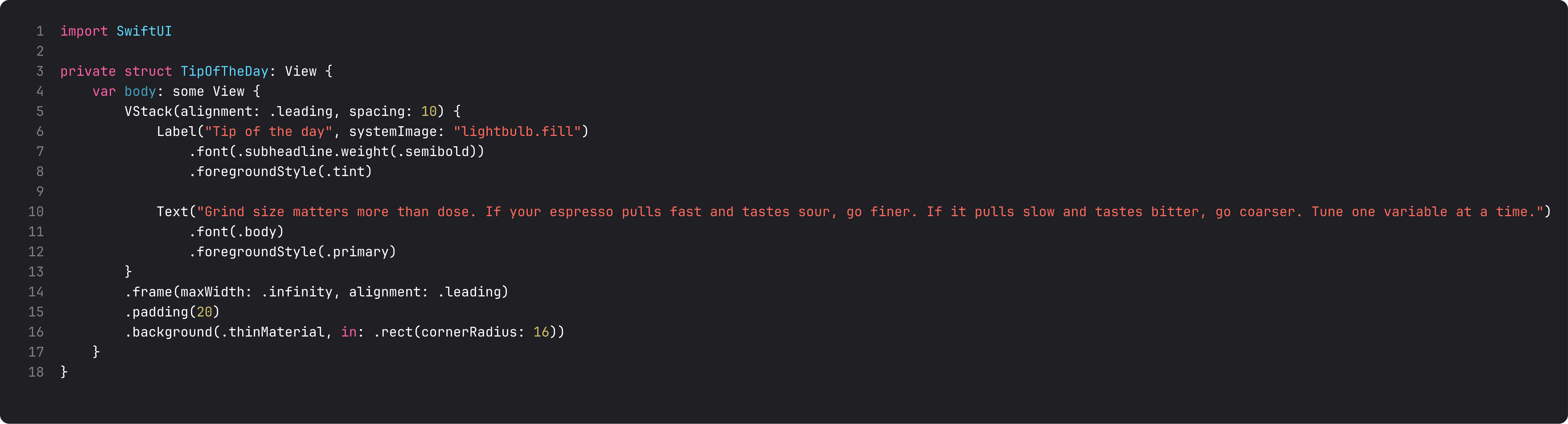
VStack(alignment: .leading) aligns the children’s leading edges to each other. But by itself, the VStack only takes as much horizontal space as its widest child. To make the card fill the row, we add .frame(maxWidth: .infinity, alignment: .leading). The .infinity part says “take all available width.” The alignment: .leading part says “but keep the content pinned to the leading edge inside that wider frame.”
This is one of the patterns that separates SwiftUI you wrote in week one from SwiftUI you write in week six. Without it, your card content drifts toward the center as soon as you give it room to breathe.
A trap I see weekly: mixing padding and ignoresSafeArea
Common LLM-generated bug:
ScrollView {
    VStack(spacing: 32) {
        // ... content ...
    }
    .padding()
    .ignoresSafeArea() // ← wrong layer
}
The author wanted the gradient to flow behind the status bar. They reached for ignoresSafeArea() and applied it to the content. Now the content scrolls under the notch and looks broken.
ignoresSafeArea() should only be on layers that are meant to extend edge-to-edge — backgrounds, full-bleed images, materials. Content (text, lists, anything readable) should respect the safe area. The pattern is always:
ContentView()
    .background(WhateverShouldGoEdgeToEdge.ignoresSafeArea())
Modifier on the background, not on the content. You’ll get this wrong once and never forget. What this is really about: SOLID’s separation of concerns applied to layout layers. The content layer is responsible for readability. The decoration layer is responsible for visual fill. Mixing their rules creates the mess.
What it looks like running
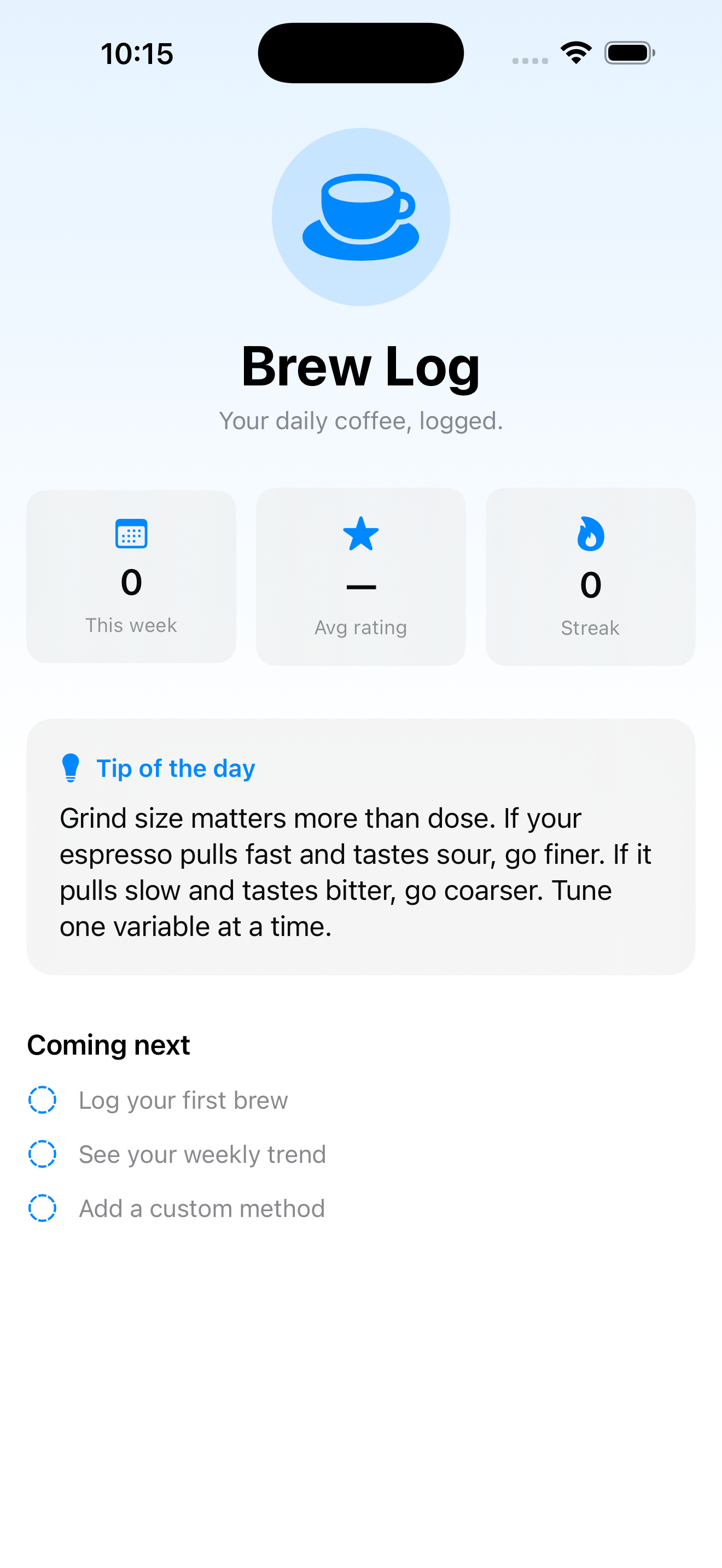
The home screen now scrolls. Notice the gradient at the top extends behind the status bar without pushing content under it. Tip card hugs the leading edge and grows to fill the row. The “Coming next” placeholder is just three rows of Text with circle.dashed icons — we’ll wire it up to real navigation in lesson 13.
Takeaway
Layout in SwiftUI is one short rule: parent proposes, child decides. frame is how you negotiate either side. ScrollView adds scroll behavior with zero config. .background paints behind, .overlay paints in front. ignoresSafeArea belongs on decoration, not content.
Internalize these five modifiers and you can build 80% of any iOS screen without reaching for anything more advanced.
Next lesson: state. We add a “favorites” toggle to the tip card and learn the difference between @State (own) and @Binding (borrow) — plus three controls (Toggle, Slider, Stepper) that show off bound state.
NativeFirst Team
EditorialThe NativeFirst team — engineers and designers building native Apple apps and writing the courses we wish we had when we started.
Comments
Leave a comment