Form Controls — DatePicker, ColorPicker, ProgressView
We covered Toggle, Slider, and Stepper in lesson 6 when we were learning bindings. There are three more system controls that round out the form-input toolbox: DatePicker for time and dates, ColorPicker for colors, and ProgressView for “how far through this thing are we.” All three take bindings, all three look great by default, all three are easy to use wrong.
This lesson catalogs them, calls out the variant you’ll actually pick in production, and BrewLog gets a weekly goal progress bar plus a daily reminder time picker.
DatePicker — five styles, one decision tree
DatePicker binds to a Date and shows the system date/time picker. The two parameters that matter most are displayedComponents (which fields to expose) and datePickerStyle (how it looks).
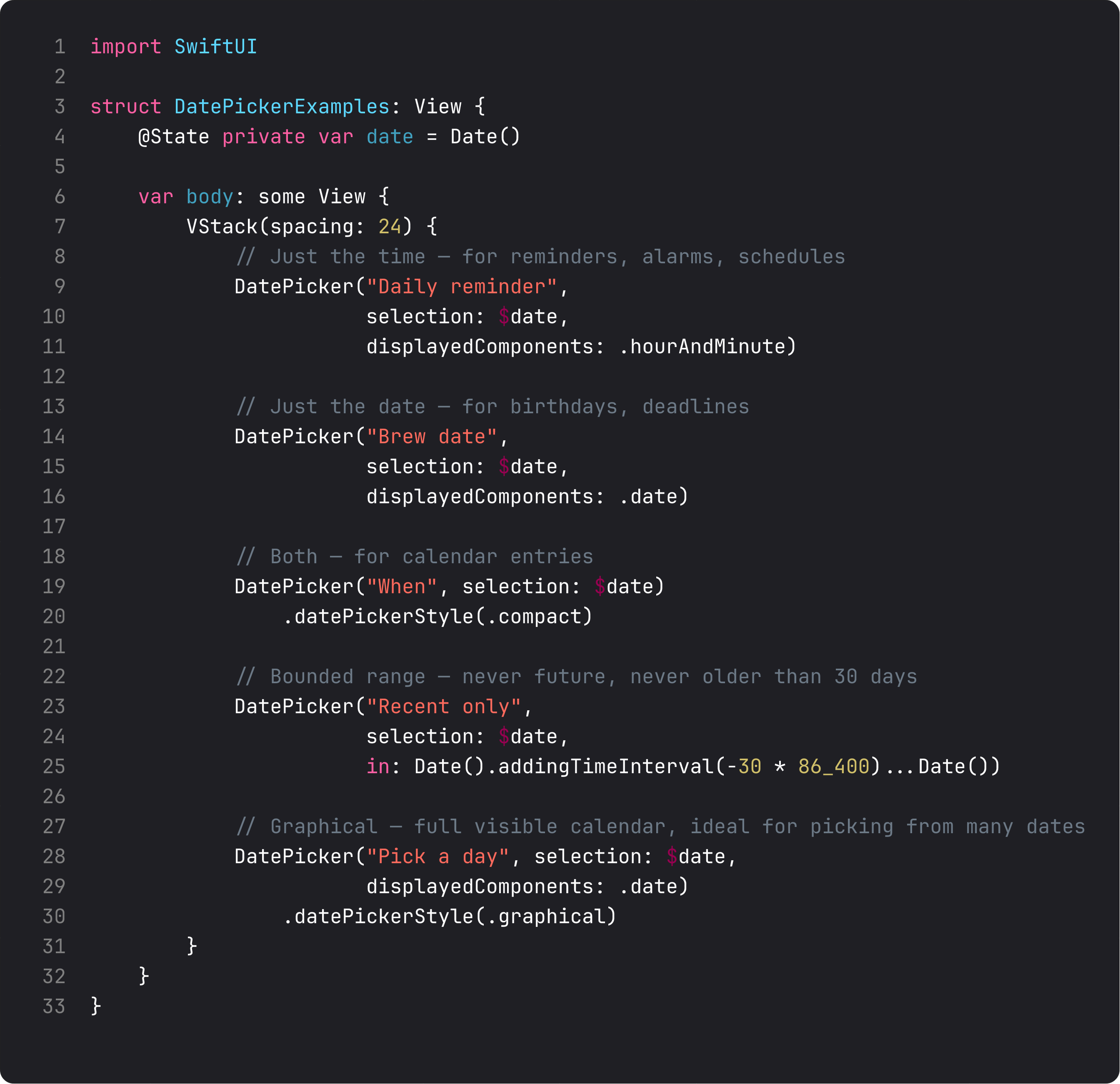
The decision tree:
.hourAndMinutedisplayedComponent — for reminders, alarms, schedules. Picks just the time. (BrewLog uses this.).datedisplayedComponent — for birthdays, deadlines, anything calendar-shaped. Default style is a tappable label that opens a popover.- Default style + both components — for general datetime entry. Compact tap-to-expand UI.
in:range — bound the selection. Useful for “future only” or “past 30 days only.” The system disables out-of-range options instead of letting the user pick a bad value..graphicalstyle — full visible monthly calendar. Use when picking is the main task on the screen, not a side input. Big, beautiful, feels like the system Calendar app.
The displayedComponents parameter gives you exact control over what’s editable. [.date] shows date only, [.hourAndMinute] shows time only, [.date, .hourAndMinute] (the default) shows both. Ask only for the components you need. A reminder time doesn’t need a date. A birthday doesn’t need a time.
ColorPicker — tiny API, big payoff
ColorPicker binds to a Color and opens the system color panel. Two-line component, infinite use cases.
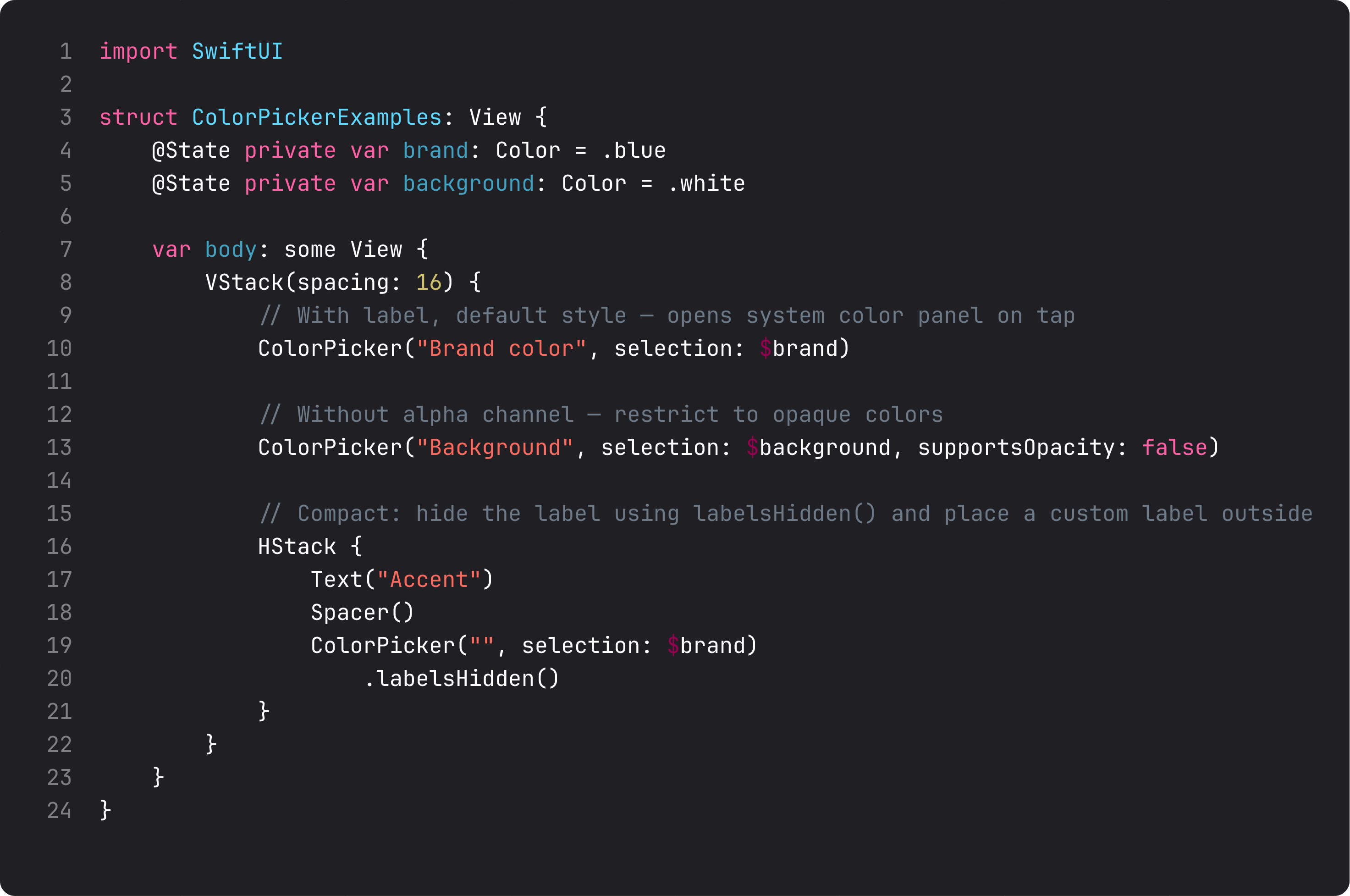
Three things to know:
supportsOpacity: false— restrict picking to opaque colors. Important when the color drives a fill or background where transparency would look broken..labelsHidden()— hide the built-in label so you can place a custom one (with weight, font, layout) outside the picker. The classic move when ColorPicker sits inside a card you’ve already styled.- Persistence is on you.
Colordoesn’t conform toCodable. To save a user-picked color in@AppStorageor SwiftData, store it asData(usingUIColorarchiving) or as components (red, green, blue, opacity) and reconstruct on read. We’ll skip BrewLog’s accent-color picker for now to avoid that detour.
ColorPicker is one of those controls that’s perfect when you need it and pointless when you don’t. Don’t add a “theme color picker” to a settings screen unless users have actually asked for one.
ProgressView — linear, circular, determinate, indeterminate
ProgressView is the spinner-or-bar you reach for whenever something is loading or progressing. SwiftUI handles the look; you handle the value (or skip the value for “we don’t know how long this takes”).
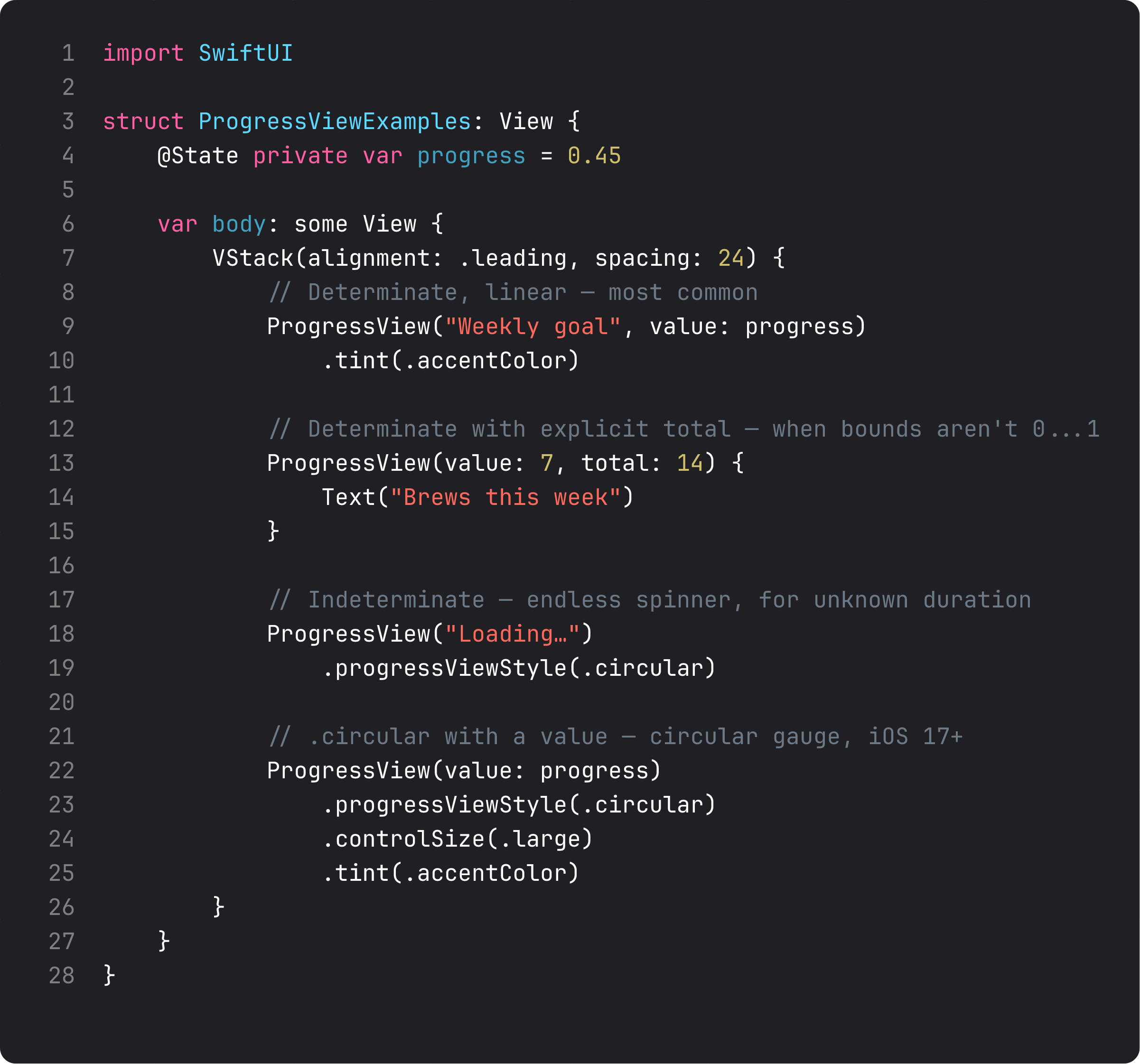
The four shapes:
- Determinate linear —
ProgressView(value: progress)withvaluebetween 0 and 1. The most common shape. BrewLog uses this for the weekly goal. - Determinate with explicit total —
ProgressView(value: 7, total: 14). When the bounds aren’t 0…1, this avoids manual division. - Indeterminate — no
value:parameter, justProgressView("Loading…"). Animated pulse for unknown duration. - Circular —
.progressViewStyle(.circular). Use for compact spaces (status icons, inline indicators) or when the visual gauge metaphor is what you want.
.tint(.accentColor) on a ProgressView changes the fill color. .controlSize(.large) on a circular ProgressView makes a much larger gauge — useful for hero-area “loading” states.
The thing to never forget: if the operation can fail, don’t just show a ProgressView. Show a state machine — loading | loaded | empty | error. We’ll cover that pattern in Course 2 when we hit networking.
A trap every team hits: progress with no ceiling
The vibe-coded version of “show progress” almost always looks like this:
@State private var brewsLoggedToday = 0

ProgressView(value: Double(brewsLoggedToday))   // ← bug: out of bounds at brews ≥ 1
ProgressView(value:) expects 0…1. Pass 5 and the bar maxes out and silently stops working. The right fix is either an explicit total — ProgressView(value: Double(count), total: 14) — or normalizing to 0…1 yourself with a clamp:
var weeklyProgress: Double {
    guard weeklyGoal > 0 else { return 0 }
    return min(1.0, Double(weeklyCount) / Double(weeklyGoal))
}
That’s exactly what UserPreferences.weeklyProgress does. Always clamp derived progress values. A progress bar that quietly maxes out and stays still is one of those bugs nobody reports because nobody notices.
What it looks like running
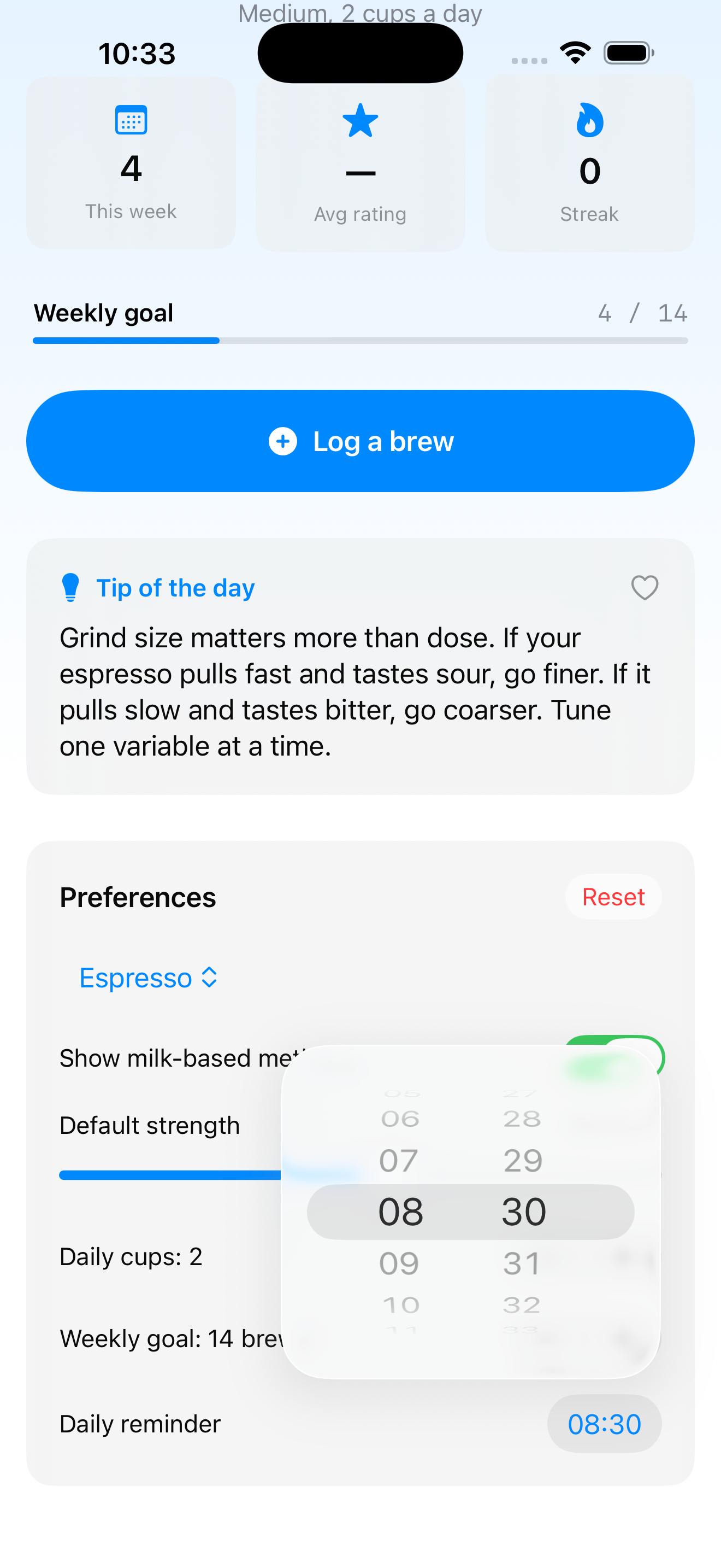
The video logs four brews — weekly progress fills 0/14 → 4/14 (28%). Then we scroll to Preferences and see the daily reminder time picker and the weekly goal stepper, both bound to the same UserPreferences model living in the environment.
This is also the first lesson where you can really see the data flow paying off: one model, eight controls reading and writing to it, every change reflected in two or three places without us writing a single update routine.
Takeaway
DatePicker for dates and times — match displayedComponents to what the user is actually picking, no more. ColorPicker when colors matter and persistence isn’t a problem. ProgressView for progress — clamp your values, model failure as a separate state.
Your form-control toolbox is now: Toggle, Slider, Stepper, DatePicker, ColorPicker, ProgressView, plus Button/Menu/Picker from last lesson. Nine controls, virtually every settings screen ever shipped.
Next lesson: lists. We finally turn “Coming next” into a real List of brews with sections, swipe actions, and the empty state every well-built iOS app handles properly.
NativeFirst Team
EditorialThe NativeFirst team — engineers and designers building native Apple apps and writing the courses we wish we had when we started.
Comments
Leave a comment