TabView, Toolbar, and LazyVGrid
Three structural components show up in roughly half the iOS apps you’ve ever used: TabView (the bottom-bar app shell), .toolbar (the bar at the top of every screen), and LazyVGrid (the grid layout that replaces ten years of UICollectionViewFlowLayout pain).
Apps without a tab bar feel like single-screen utilities. Apps without .toolbar feel unfinished. And the day you need a grid of methods, settings tiles, or photo thumbnails, LazyVGrid is the answer in five lines instead of fifty.
This lesson splits BrewLog into a real two-tab app — Home and Settings — moves the overflow menu into the toolbar, and uses LazyVGrid for a “methods” gallery in Settings. After this lesson, BrewLog is structurally complete. Lesson 17 just adds persistence; lesson 18 ships.
TabView — the modern Tab API
iOS has had tab bars since the original iPhone. SwiftUI’s API has caught up:
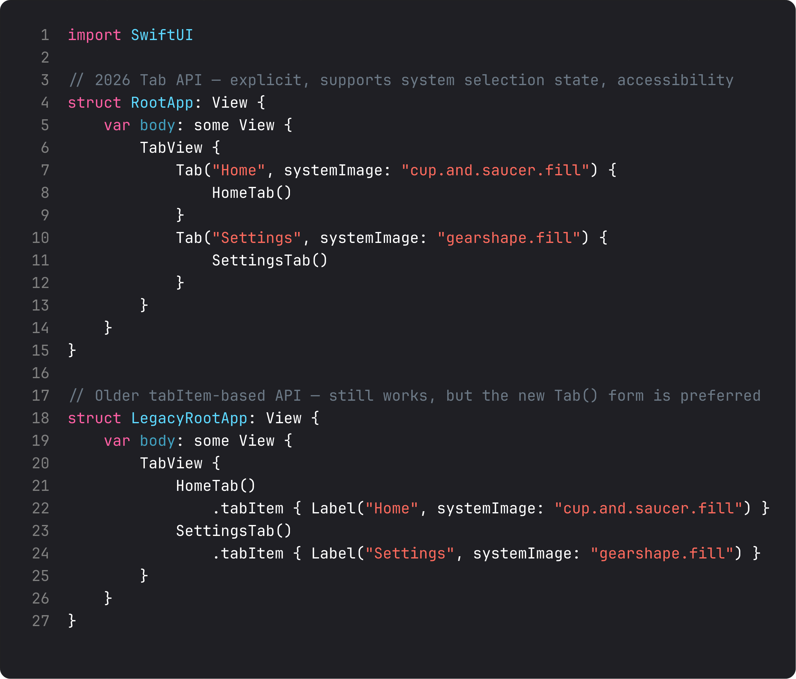
The pattern in three rules:
- Use the new
Tab(...)form for new code. It’s explicit, supports the system’s customization features (drag to reorder on iPad), and reads cleaner. - Each tab’s content is its own
NavigationStackif it has navigation. Tabs are independent navigation hierarchies — switching tabs preserves each one’s stack state. Tap Home tab, drill into a brew, switch to Settings, switch back — Home is still on the detail screen. - 3–5 tabs is the sweet spot. Two if your app is tightly focused (BrewLog: Home + Settings). More than five and you’re hiding tabs behind “More” — almost always a sign the app is doing too much.
Don’t put a NavigationStack around a TabView. The pattern is the other way: TabView at the root, NavigationStack inside each tab. Wrong order and the nav bar tries to draw across the whole app and looks broken on a tab switch.
Toolbar — the placements that matter
.toolbar { ... } adds items to the navigation bar (and, in some cases, the bottom bar or keyboard). The trick isn’t the modifier — it’s knowing which placement: to use:
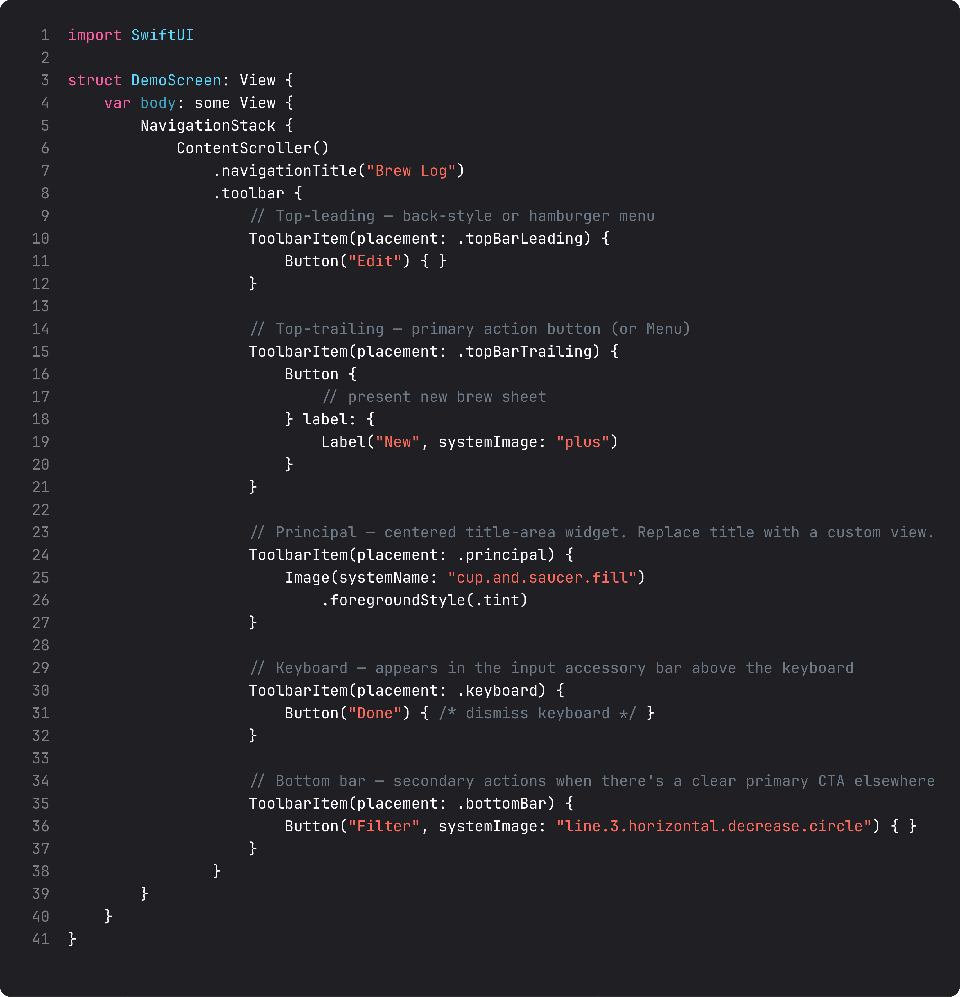
The placements you’ll use weekly:
.topBarLeading— back-style buttons or hamburger menus. Don’t put primary actions here..topBarTrailing— the primary action button. ”+” for new, “Edit”, “Done”, or a Menu for overflow. The single most-used placement..principal— replaces the centered title with a custom view. Use sparingly — for app logos or pill segmented controls..keyboard— the input accessory above the keyboard. Perfect for “Done” buttons that dismiss the keyboard, or formatting toolbars..cancellationAction/.confirmationAction— semantic placements for sheet toolbars (which we used for the compose sheet last lesson). Apple positions them correctly per locale automatically..bottomBar— secondary actions when there’s already a primary CTA. Less common in modern iOS than it was pre-iOS-16.
A subtlety: .toolbar only shows up inside a NavigationStack. No NavigationStack, no bar to attach to, no items render. That’s why each tab needs its own NavigationStack — and why the tab-then-NavigationStack ordering matters.
For BrewLog, we moved the ”…” menu out of the inline HeroCard and into the Settings tab’s .topBarTrailing placement. The home tab’s ”+” stays in its own .topBarTrailing. Both are reachable from the system nav bar — exactly where a user expects them.
LazyVGrid — the grid you’ll actually reach for
LazyVGrid is the SwiftUI replacement for UICollectionView’s grid layouts. Lazy means it only renders visible cells — fast even with thousands of items.
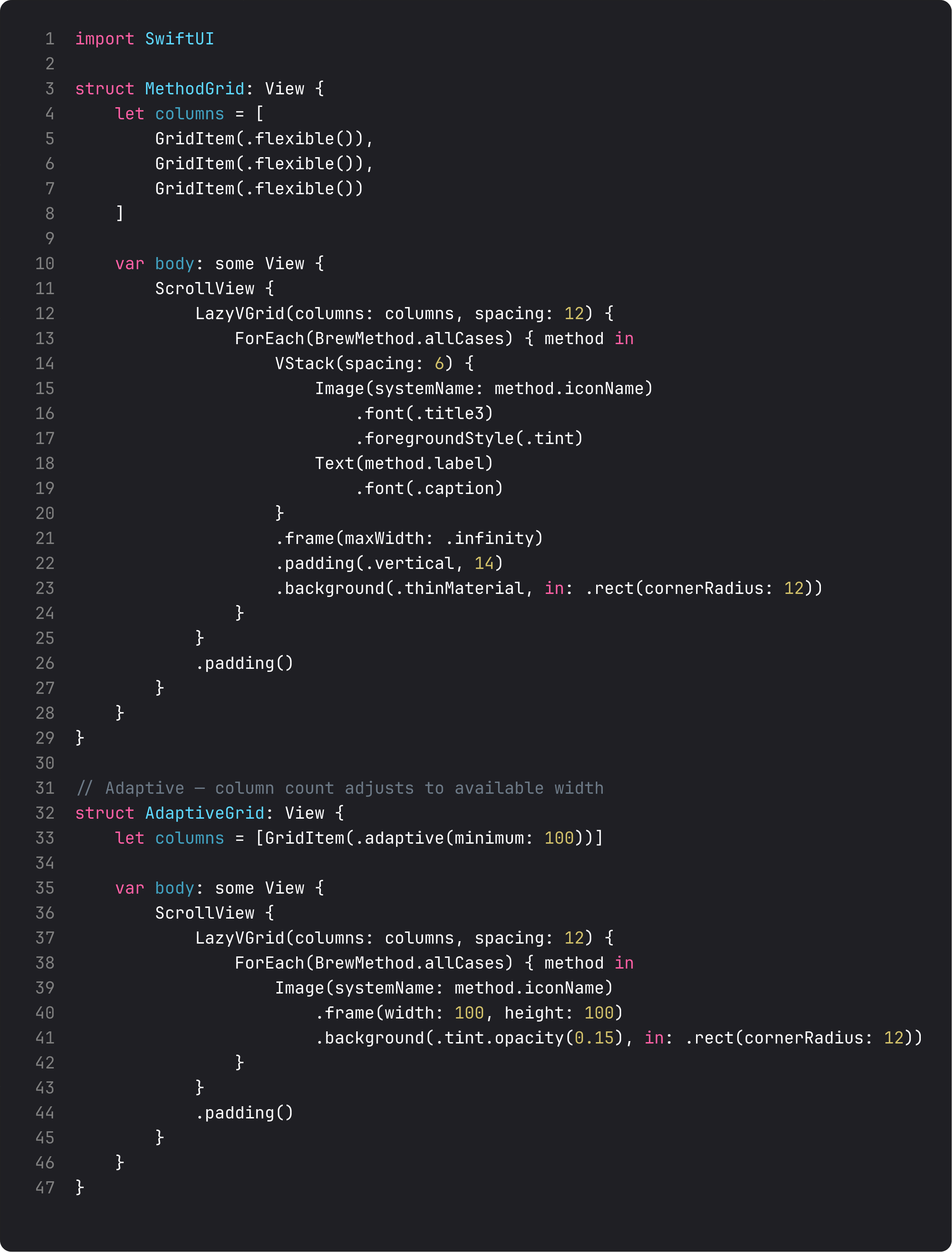
Two columns approaches handle 90% of cases:
- Fixed count —
[GridItem(.flexible()), GridItem(.flexible()), GridItem(.flexible())]for exactly 3 columns. Each gets equal space. - Adaptive —
[GridItem(.adaptive(minimum: 100))]lets SwiftUI fit as many columns as fit, each at least 100pt wide. This is what you want for photo grids or icon collections that should pack tighter on iPad.
LazyVGrid lives inside a ScrollView. (Don’t wrap it in a List — the layouts fight.) For a horizontally-scrolling row, use LazyHGrid and a horizontal ScrollView. Same idea, sideways.
The Settings tab’s “Methods” card uses a fixed 3-column grid. Five method cards, three columns, two rows (the second row has only two cells — fine, the grid handles partial last rows automatically). On iPad it’d wrap differently because the screen is wider — adaptive column-counts let layouts respond to space without media queries.
A trap I see weekly: TabView around NavigationStack
The vibe-coded version of “make my app tabbed”:
NavigationStack {
    TabView {
        Tab("Home") { /* ... */ }
        Tab("Settings") { /* ... */ }
    }
}
The NavigationStack is at the wrong level. Result: the nav bar tries to span across both tabs, the back button doesn’t know what to pop, switching tabs breaks. The fix is the right ordering:
TabView {
    Tab("Home") {
        NavigationStack {
            HomeContent()
        }
    }
    Tab("Settings") {
        NavigationStack {
            SettingsContent()
        }
    }
}
TabView at the root, NavigationStack per tab. Each tab gets its own independent navigation hierarchy. This is also exactly how Apple’s own apps (Mail, Photos, Reminders) do it.
What it looks like running
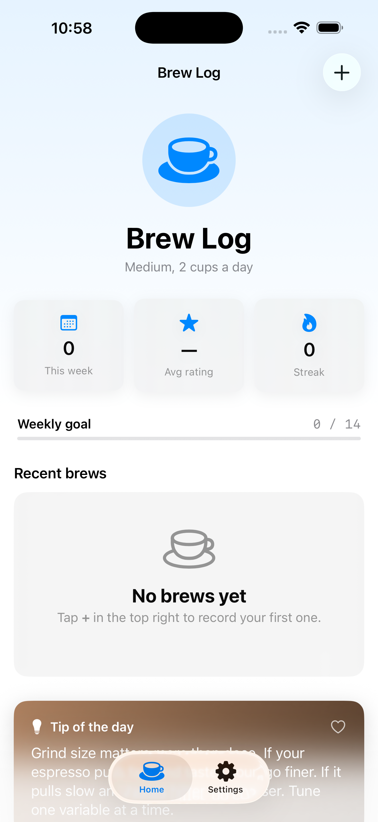
The video opens to the Home tab — gradient background, hero, stats, recent brews. Tap Settings tab — large “Settings” title, Preferences card, Methods grid (5 method tiles in 3 columns), top-trailing menu (the ”…” overflow). Tap Home tab — back to where we were, navigation state preserved.
This is BrewLog’s final structural shape. Lesson 17 wires up SwiftData persistence so brews survive app restarts. Lesson 18 polishes and ships.
Takeaway
TabView at the root for app-shell navigation. NavigationStack inside each tab for hierarchical drill-down. .toolbar for nav-bar items, with semantic placements (.topBarTrailing, .cancellationAction, etc). LazyVGrid with fixed or adaptive columns for grid layouts.
The right ordering: TabView → NavigationStack → ScrollView/Form → content. Get this skeleton right and the rest of the app slots in cleanly.
Next lesson: SwiftData. We replace the in-memory recentBrews array with a real persisted store, so brews actually survive app launches. Last lesson before the ship checklist.
NativeFirst Team
EditorialThe NativeFirst team — engineers and designers building native Apple apps and writing the courses we wish we had when we started.
Comments
Leave a comment