Text, Image, Color — and Why Modifier Order Matters
SwiftUI ships with three primitives that actually render pixels on screen: Text, Image, and Color. Everything else is composition. Every screen you’ll ever build comes back to chaining these three with modifiers.
There’s also one rule about modifiers that almost nobody mentions in the first lesson — the order you write them changes the result. Not “sometimes.” Always. We’ll get to that.
By the end of this lesson the BrewLog home screen has a hero icon, a title, and a subtitle, all stacked into a greeting card. Twenty lines of code, zero assets imported.
Text — words on screen, with opinions
Text is the simplest view in SwiftUI. You give it a string, you get text on screen. The interesting part is the chain of modifiers that follow it.
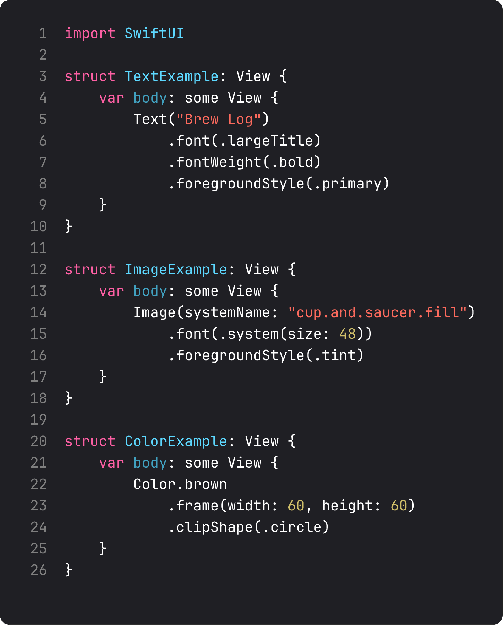
A few things worth knowing about Text that only show up when you ship something real:
Text("Brew Log")is aLocalizedStringKeyinitializer. That string isn’t just a string — SwiftUI will look it up in your.stringsfiles at render time. If you don’t want that behavior (you’re showing user-generated content, or a brand name that should never translate), useText(verbatim: "Brew Log"). Most courses skip this. It bites at App Store review when you finally ship localized..font(.largeTitle)is a semantic font, not a size..largeTitle,.title,.headline,.subheadline,.body,.caption— these scale with Dynamic Type automatically. The day a user with vision impairment turns their accessibility text size up to maximum, your UI doesn’t break. Hardcoded.font(.system(size: 34))doesn’t scale. Use semantic fonts unless you have a specific reason not to..foregroundStyle(.tint)beats.foregroundColor(.blue)..tintadapts to the system accent or your asset-catalog tint..blueis just blue. Same idea: lean on the system, override only when you mean it.
Text is doing a lot. The view itself is a thin handle to all of this — the modifiers tell SwiftUI which knobs to turn.
Image — SF Symbols are the unfair advantage
Image(systemName: "cup.and.saucer.fill") and you have a coffee cup icon. No asset, no PSD, no exporting at 1x/2x/3x.
SF Symbols is Apple’s system icon library. Six thousand symbols. Free. They scale with the surrounding font weight, support multicolor variants, animate on tap when you set them up to. Your app gets a consistent visual language with iOS for free.
A small but important detail: Image(systemName:) symbols size with .font(...), not .frame(...). They’re text. Treat them like a glyph, not a bitmap.
Image(systemName: "cup.and.saucer.fill")
    .font(.system(size: 56))      // controls the glyph size
    .foregroundStyle(.tint)        // tints the symbol
When do you reach for an asset-catalog Image("BrandLogo") instead of an SF Symbol? Three cases — your brand mark, complex illustration, or photography. Everything else, try SF Symbols first.
Color — yes, it’s a view
This one trips people up. Color.brown isn’t a property. It’s a view. You can put it directly in a layout, give it a frame, clip its shape:
Color.brown
    .frame(width: 60, height: 60)
    .clipShape(.circle)
That gives you a brown circle. No Shape, no Rectangle. Just a color filling a frame, then clipped.
This is how you build the soft tinted circle behind our coffee icon: .background(.tint.opacity(0.15), in: .circle). Color, opacity, shape — three modifiers compose into a UI element that looks like it took someone an hour in Figma.
We’ll lean on this pattern hard in BrewLog. Most “card” backgrounds in this course are just Color or .background(...) calls, not custom shapes.
The big one: modifier order matters
This is the rule everyone trips over in week one. Modifiers don’t style a view. They wrap it — every modifier returns a new view that contains the previous view. Order is nesting.
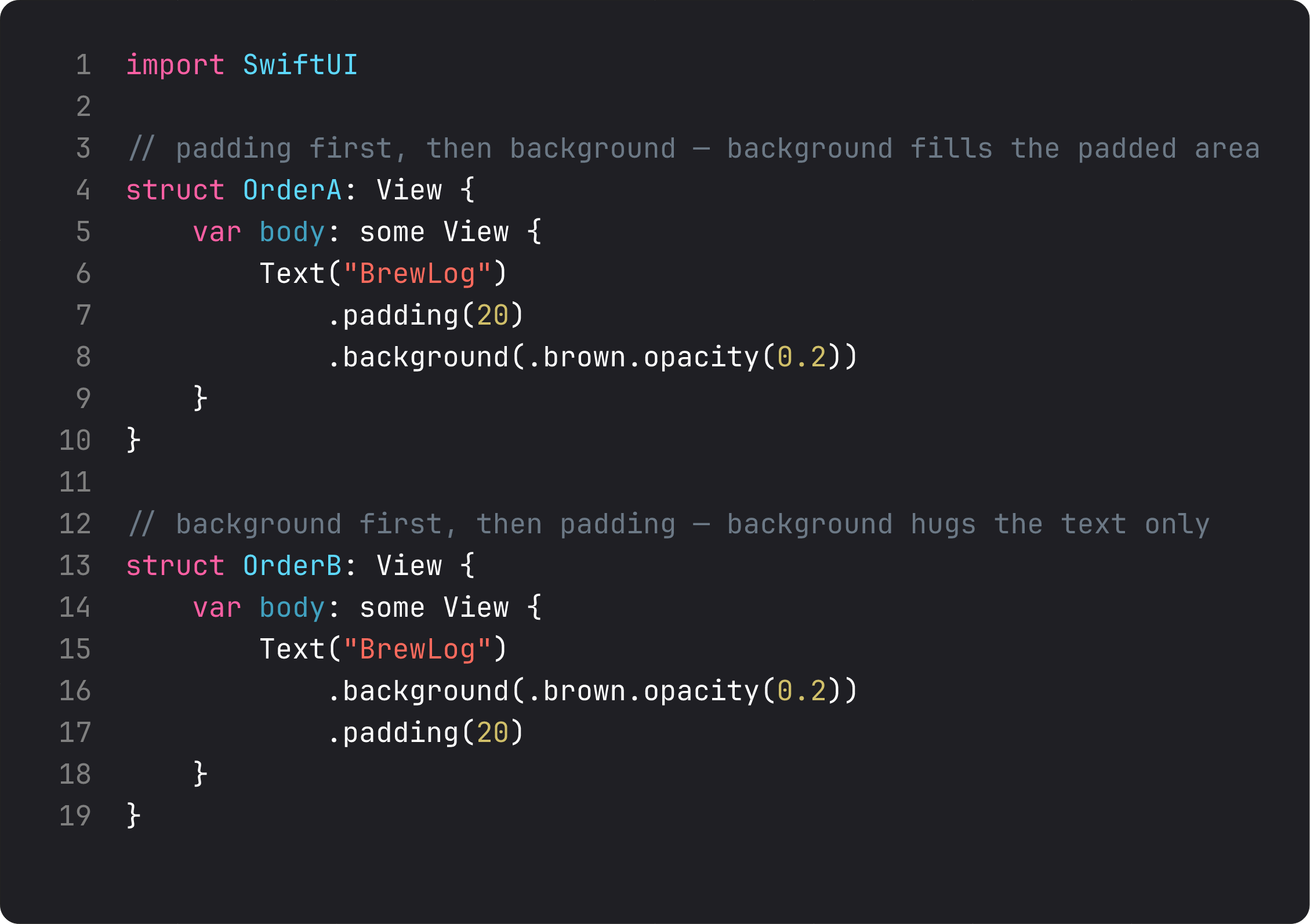
Order A — .padding(20).background(.brown.opacity(0.2)) — gives you text with a colored area that includes the padding. The brown extends 20 points around the text.
Order B — .background(.brown.opacity(0.2)).padding(20) — gives you text with a colored area that hugs the text exactly, then 20 points of empty space outside it.
Both compile. Both run. They look completely different.
Real-life analogy: modifiers are like Instagram filters stacked in order. “Brightness then contrast” lands somewhere different from “contrast then brightness.” The image is the same; the order of the operations is the picture.
The mechanical reason: each modifier wraps the view it’s called on. .padding() says “give me a new view that’s 20pt bigger on all sides.” .background() says “give me a new view that paints something behind whatever I just received.” Whichever you call last is the outermost wrapper.
Once this clicks, you stop guessing. You read the chain bottom-up: “what view does the last modifier receive?” That’s what gets the treatment.
A trap I see every week
Here’s the antipattern that shows up in code reviews — usually generated by an LLM, sometimes by a confused human:
struct ContentView: View {
    var body: some View {
        Text("Brew Log")
            .padding()
            .background(Color(red: 0.42, green: 0.31, blue: 0.20))
            .padding()
            .foregroundColor(.white)
            .font(.system(size: 34, weight: .bold, design: .default))
            .padding()
    }
}
Three pieces of pain in one screen:
- Hardcoded
Color(red:green:blue:). This color doesn’t adapt to dark mode, doesn’t live in your asset catalog, and won’t be reused anywhere. Use a named color asset (Color("BrandBrown")) or a system semantic (.tint,.brown) and declare your palette once. SOLID’s open/closed principle, applied to design tokens — your palette should be open to extension, closed to scattered redefinition. - Three calls to
.padding(). Each one wraps the previous, so we now have a view nested four layers deep just to get spacing. One.padding()(or one with explicit edges) does the job. .font(.system(size: 34, weight: .bold)). Hardcoded size, no Dynamic Type support. The vision-accessible user can’t read this. Use.font(.largeTitle.bold()).
Vibe-coding this kind of thing is fine for a 5-minute prototype. Shipping it is how you end up with a settings screen that looks great on iPhone 14 Pro and unreadable on a 2018 SE with Larger Text turned on.
Building the greeting card
Here’s the BrewLog home screen at the end of this lesson — a hero icon in a soft tinted circle, then a centered title and subtitle.
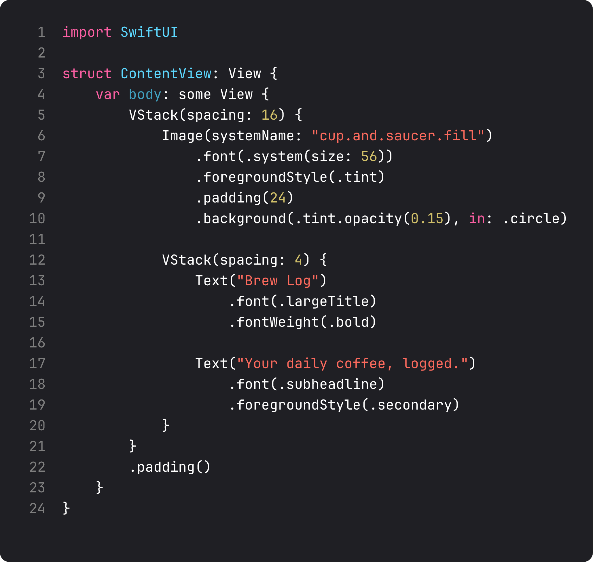
Read that bottom-up. The icon gets .foregroundStyle(.tint) (so it picks up our accent), then .padding(24) (to give breathing room inside the circle), then .background(.tint.opacity(0.15), in: .circle) (which paints a translucent circle behind everything we’ve stacked so far). The padding is inside the circle because we added padding before the background.
Four modifiers in the right order. That’s the whole composition trick.
What it looks like running
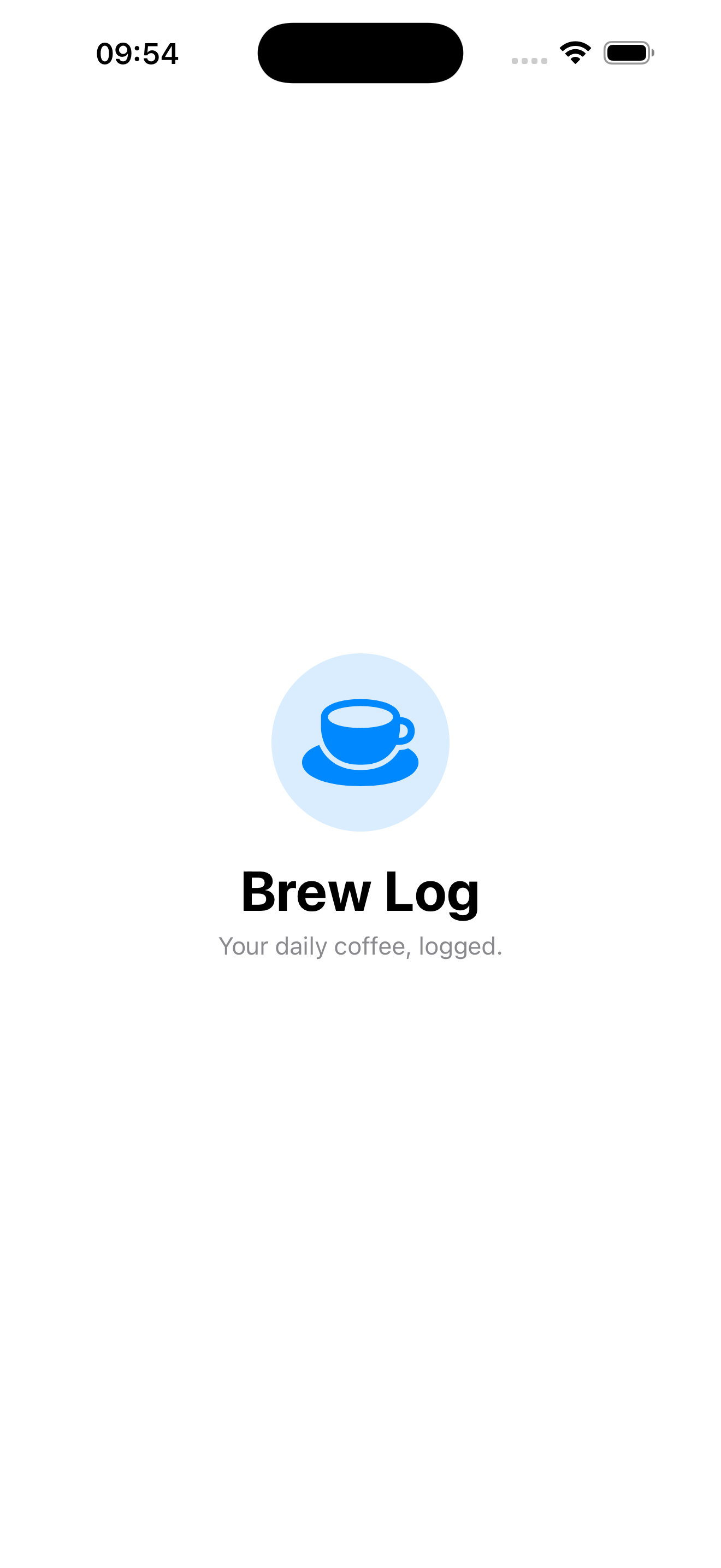
Same screen we had in lesson 1, plus a hero icon, plus a styled circle background. Twenty lines of code total — the cup icon, the tinted circle, the title, the subtitle, the layout. Dynamic Type, dark mode, and accessibility all keep working without a single explicit line.
That’s the pattern: small primitives, lots of modifiers, in the right order.
Takeaway
Text, Image, Color are the only views in SwiftUI that actually paint pixels — everything else is composition. Modifiers wrap, they don’t style. Order is nesting. Read the chain bottom-up to know what ended up on the outside.
If you remember nothing else from this lesson, remember the order rule. It’s the single most common cause of “why does my SwiftUI look different from what I wrote” questions on every dev forum.
Next lesson: we put these primitives into stacks — VStack, HStack, ZStack, plus the tool everyone underuses, Spacer. We learn to compose layouts without the nine-deep nesting trap.
NativeFirst Team
EditorialThe NativeFirst team — engineers and designers building native Apple apps and writing the courses we wish we had when we started.
Comments
Leave a comment