Shapes, Gradients, Materials, and Visual Effects
We’ve been quietly using shapes, gradients, materials, and effects throughout the course. The HeroCard’s circle background, the ScrollView’s gradient overlay, every .thinMaterial card — all of it is the visual toolbox we never sat down to inventory. This lesson does that.
The point isn’t to memorize every shape and gradient parameter. It’s to know what’s available, when each one is right, and where to reach when “this looks fine but not great” is what you’re staring at.
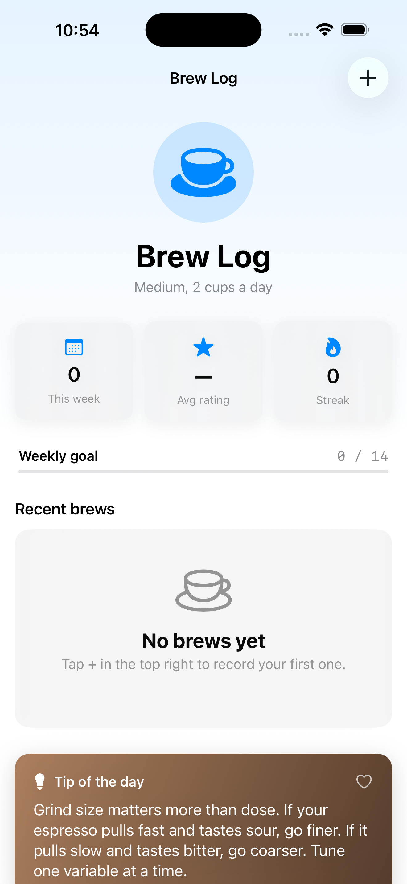
By the end of this lesson, BrewLog’s tip-of-the-day card has a real gradient background (no more thin material — coffee deserves better), every stat card has a soft shadow, and the difference between before and after is the kind of thing you notice without being able to articulate why.
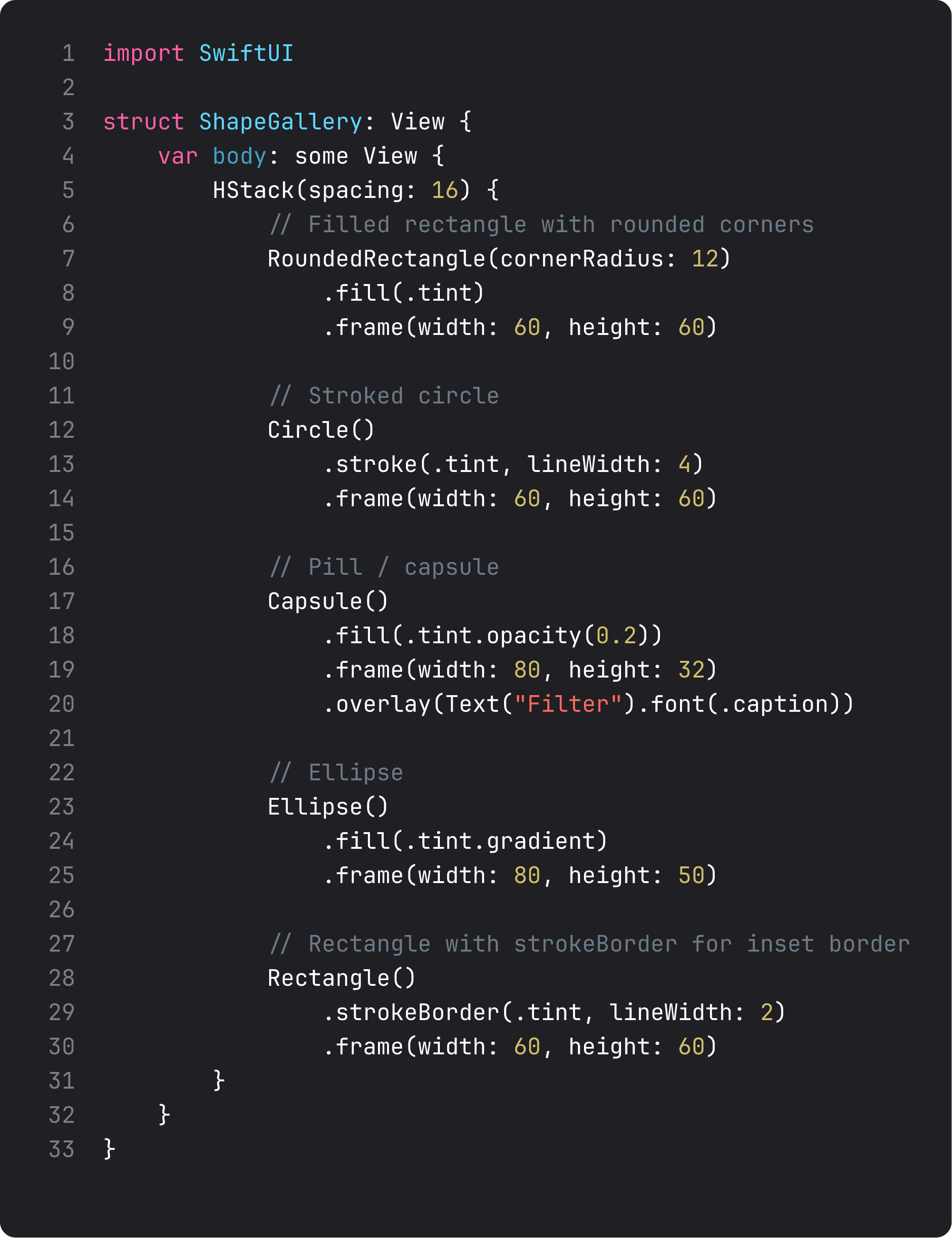
Shapes — the five you’ll actually use
SwiftUI ships about a dozen Shape types. In practice, five do 95% of the work:
The decision tree:
RoundedRectangle(cornerRadius:)— every card background, every button, every chip. The default rectangle of modern iOS. Use.continuouscorner style for that smooth Apple curve (the default is.circular, which has a subtle but visible shoulder).Circle— avatars, status dots, hero icons (we use this all over BrewLog). Size with.frame; the circle fills.Capsule— pills, tags, segmented selectors, badges. LikeRoundedRectanglebut the corner radius adapts to half the height. Always pill-shaped.Ellipse— rare, but useful for “vaguely round but not a perfect circle” hero shapes.Rectangle— the boring rectangle. Use it for full-bleed backgrounds, dividers, hit areas, or as the base for overlay/clipShape compositions.
Three modifiers do most of the work:
.fill(_)— fills the interior. Takes anyShapeStyle(color, gradient, material, hierarchical)..stroke(_, lineWidth:)— draws an outline. Centered on the path edge — half inside, half outside..strokeBorder(_, lineWidth:)— like stroke, but drawn entirely inside the shape. Use this for borders on sized rectangles when you don’t want the line to spill out.
Composite trick — to get a shape with both fill and outline, use .fill().overlay { Shape().strokeBorder() }. Counter-intuitively common.
Gradients — the four colors of the rainbow
Four gradient types cover every visual situation:
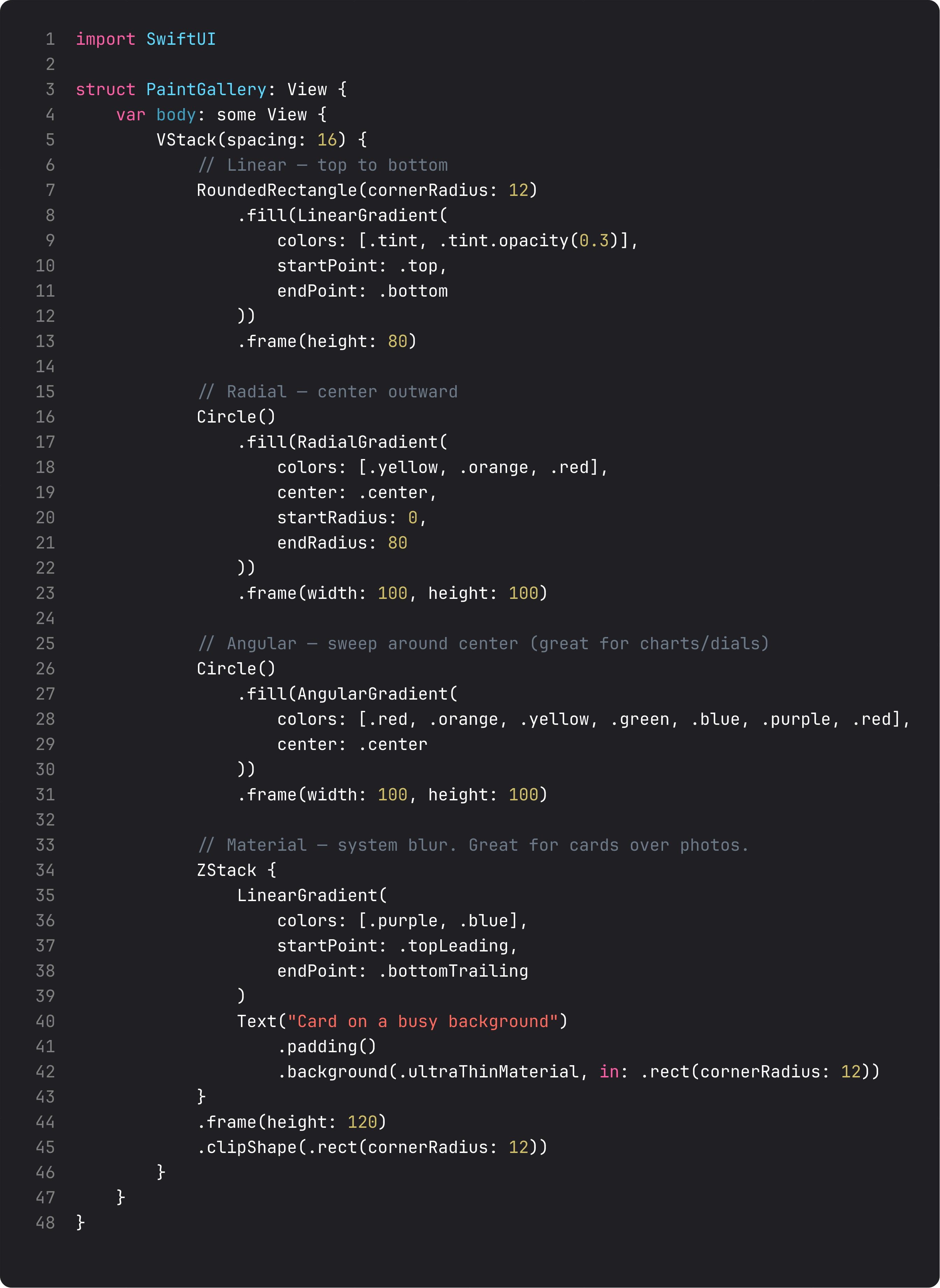
When to reach for each:
LinearGradient— the workhorse. Top-to-bottom hero gradients, button fills, card backgrounds. We use it on BrewLog’s home (gradient behind status bar) and the tip card.RadialGradient— center-outward. Spotlight effects, glow halos, focused-attention visuals. Great for empty states or success screens.AngularGradient— sweeping around a center. Charts, dials, “rainbow” effects. Visually striking, easy to overuse.- Materials (
.ultraThinMaterial,.thinMaterial,.regularMaterial,.thickMaterial,.ultraThickMaterial) — translucent system blurs. Use these for cards over photos or busy backgrounds — they pick up the underlying colors and blur them. The default-feeling iOS look.
A subtle but important detail: a Color shorthand works as a quick gradient. Text("Hello").background(.tint.gradient) gets you a free top-to-bottom gradient from the tint color. Same trick on .foregroundStyle(.tint.gradient) for gradient text. Free polish, one keyword.
Effect modifiers — the everyday five
These don’t change layout, just appearance. Stack them with no anxiety — they’re cheap.
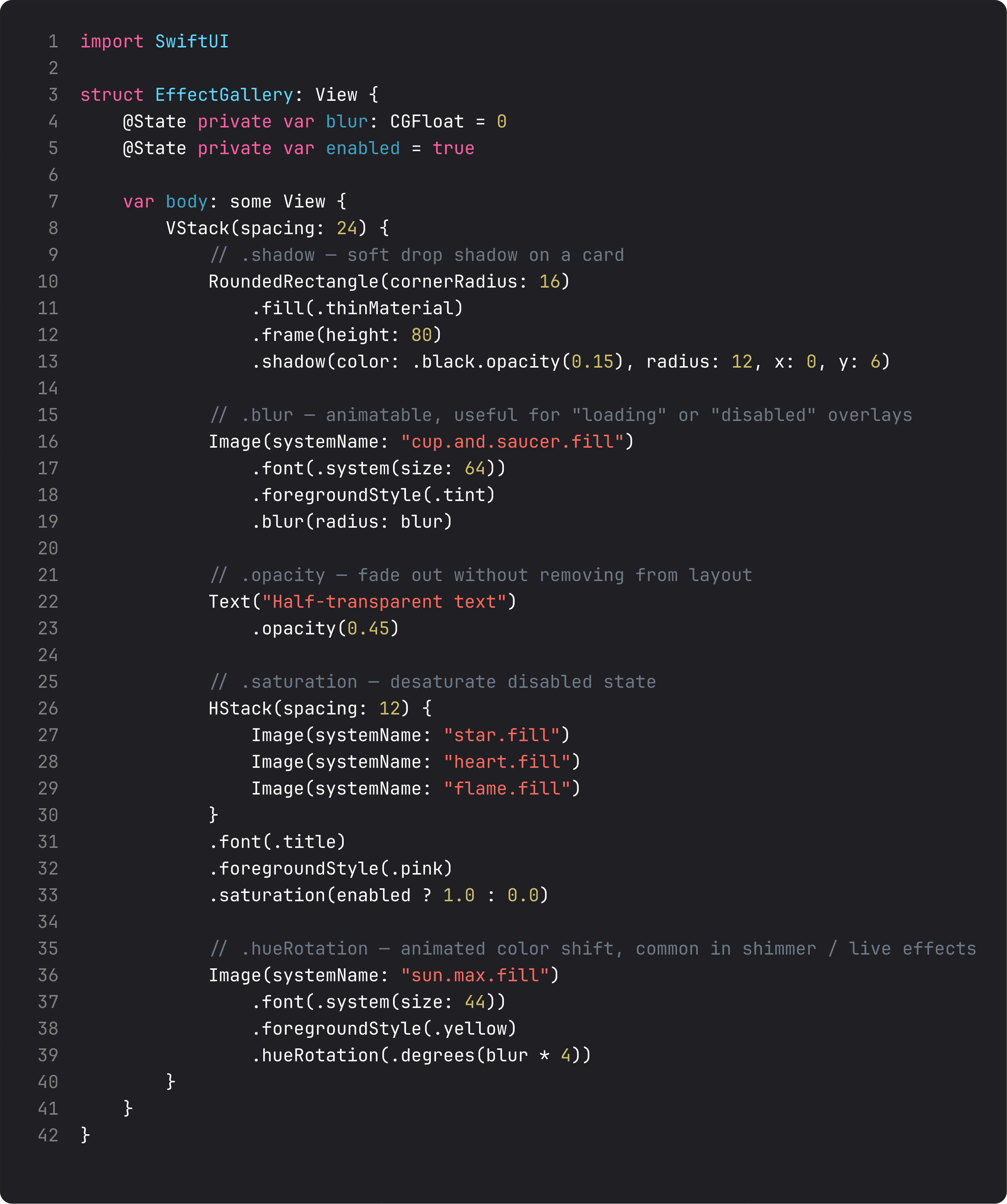
The five most common effects:
.shadow(color:radius:x:y:)— soft drop shadow. The “card lifts off the screen” effect. Pro tip: useColor.black.opacity(0.05–0.15)for subtle shadows. Pure black at full opacity looks like Photoshop, not Apple..blur(radius:)— animatable Gaussian blur. Great for “loading” or “disabled” states, modal backgrounds, transition effects..opacity(_)— fade without removing. Use for “this is here but inactive.” Different fromif/else, which removes from layout..saturation(_)— color intensity.0.0is grayscale,1.0is full color. Animate from 0 to 1 for “this is now active” reveals..hueRotation(_)— shift hue around the color wheel. Animated, makes shimmer effects and color-shifting accents.
A common production pattern: disabled state with .saturation(0).opacity(0.6). Gray, dim, clearly not interactive — without you having to design a separate disabled visual. The system handles it.
What we actually changed in BrewLog
Two specific polish moves landed this lesson:
-
TipOfTheDay card — moved from
.thinMaterialto aLinearGradientof brown shades, with white text and a.shadow(color: .black.opacity(0.15), radius: 12, y: 6). The result is a card that feels distinctly “tip-y” — different visual treatment from the other thin-material cards, which signals “this content is editorial, not data.” -
StatCards get subtle shadows —
.shadow(color: .black.opacity(0.06), radius: 8, y: 4). Almost invisible individually. Together, they lift the entire stats row off the page. Look closely and you can see them; look casually and you just feel that the screen has depth.
Two changes, ~8 lines of code. The whole screen reads as more “designed” without anyone being able to point at what changed. That’s polish — accumulated, almost invisible, decisive.
A real-world note: at scale, watch your shadows. Shadows on a list of 100 cards can degrade scroll performance. We’ll cover Instruments-driven debugging in Course 2 and Course 3, but the rule of thumb: shadows on a few hero elements, not on every row in a long list.
What anti-vibe-coding looks like for visuals
LLMs love to overdo visuals. The vibe-coded version of “make this card pretty”:
RoundedRectangle(cornerRadius: 24)
    .fill(LinearGradient(
        colors: [.purple, .pink, .blue, .orange, .yellow],
        startPoint: .topLeading,
        endPoint: .bottomTrailing
    ))
    .shadow(color: .purple.opacity(0.5), radius: 20, x: 5, y: 10)
    .shadow(color: .pink.opacity(0.3), radius: 30, x: -5, y: -10)
    .blur(radius: 0.5)
    .saturation(1.3)
Five colors in a gradient (most should be 2). Two shadows stacked (one is plenty). A blur on a card (almost never useful). Saturation cranked above 1 (the colors are already saturated; this just clips). The result is a card that screams “AI made this in 2024.”
Restraint is the move. Two-color gradients. One soft shadow. Saturation only when going below 1.0 for grayscale states. Apple’s own apps follow this discipline religiously — go look at the App Store, Notes, Reminders. Almost no double shadows. No blur on cards. The minimum needed, no more.
What it looks like running
Scroll up and down — the stat cards’ shadows shift subtly as the gradient background slides past. The brown tip card stands out clearly from the thin-material cards above and below it. None of this is dramatic. All of it is what a polished app feels like.
Takeaway
Five shapes — RoundedRectangle, Circle, Capsule, Ellipse, Rectangle — handle 95% of cases. Four gradient types — Linear, Radial, Angular, plus material — cover every paint situation. Five effects — shadow, blur, opacity, saturation, hueRotation — are the everyday polish stack.
Apply restraint. Two-color gradients. Single soft shadows. The system materials before you reach for custom blur. Polish is a series of small decisions that compound, not one dramatic flourish.
Next lesson: TabView, .toolbar, LazyVGrid — the structural pieces that take BrewLog from one-screen-and-a-modal into a proper multi-tab app. Last big visual addition before we wire up SwiftData and ship.
NativeFirst Team
EditorialThe NativeFirst team — engineers and designers building native Apple apps and writing the courses we wish we had when we started.
Comments
Leave a comment