Design System Primitives — ViewModifier, ButtonStyle, Color Tokens
By the end of lesson 9, Pulse had .padding(20).background(.thinMaterial, in: .rect(cornerRadius: 16)) typed out across six different views. That’s the smell — same six modifiers, six places, one design decision spread out.
The fix is a design system: extract repeated styling into named primitives. ViewModifier extensions for visual treatments. ButtonStyle conformances for interactive components. Color tokens for the palette. Everything else uses the primitives by name. Tomorrow’s redesign touches three files, not thirty.
This lesson ships three files: pulseCard() modifier, pulseSoft ButtonStyle, and a Color extension exposing semantic tokens. Pulse’s existing screens migrate to them in a one-line search-and-replace.
ViewModifier — the reusable visual treatment
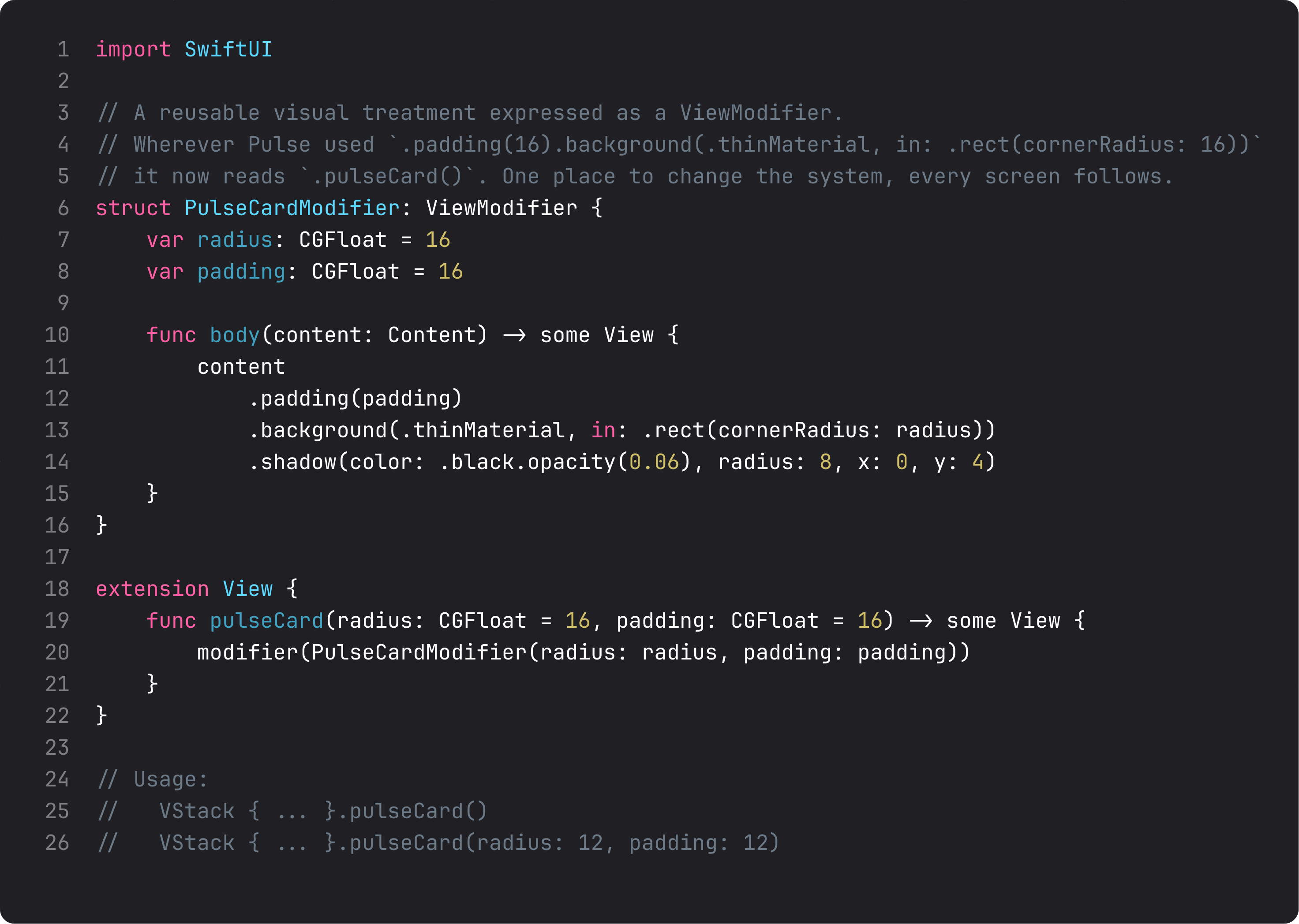
pulseCard() is six lines that replace twenty across the codebase.
The pattern in three rules:
struct ConcreteModifier: ViewModifier— a struct with abody(content:)method. Inside, you apply the wrapper modifiers tocontentand return the result. Pure SwiftUI; no inheritance, no escape hatches.extension View { func name() -> some View { modifier(...) } }— the call-site sugar. Without this you’d write.modifier(PulseCardModifier())everywhere; with it,.pulseCard(). Same code, much better ergonomics.- Default values for parameters.
radius: CGFloat = 16, padding: CGFloat = 16covers 90% of cases. The 10% that need different values pass overrides explicitly. Defaults that match the design language matter — they’re what new screens get for free.
The win: change one ViewModifier, every card in the app updates. Add a subtle border, bump shadow opacity, tweak corner radius — three lines of change, zero search-and-replace.
ButtonStyle — interactive components, native API
ButtonStyle is the same idea, scoped to buttons. The Configuration struct gives you label and isPressed — that’s all you need to build a complete interactive component.
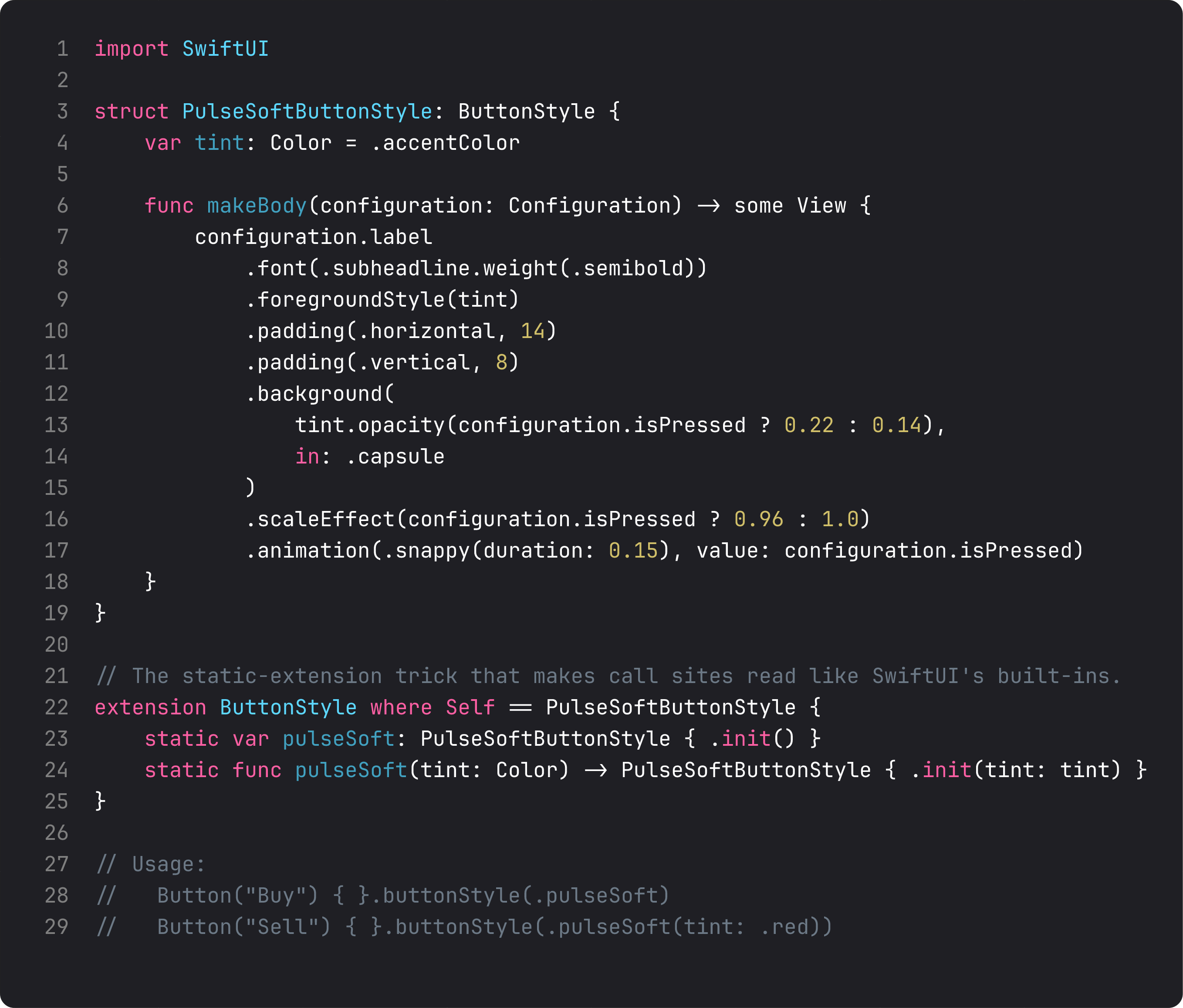
Three details that make a ButtonStyle good:
- The
isPressedstate changes more than one property. In our soft button: opacity + scale + animation. That’s the difference between a button that feels pressed and one that visually toggles. Real components animate. - The
static var pulseSoftextension onButtonStyle where Self == PulseSoftButtonStyle. This is the line that makes the call site read like Apple’s APIs:.buttonStyle(.pulseSoft). Without it you’d write.buttonStyle(PulseSoftButtonStyle()). Worth the four extra lines. .snappy(duration: 0.15)animation. Snappy is the iOS 17+ animation curve that’s springy without being bouncy — perfect for tap feedback. Don’t roll your own animation curves; use the system’s named ones.
buttonStyle propagates through child Buttons. Set it on a container and every Button inside picks it up — useful for “all primary actions in this card use the prominent style.”
Color tokens — semantic names, asset catalog reality
The third primitive is the cheapest. A Color extension exposes named tokens that map to asset-catalog colors with light + dark variants.
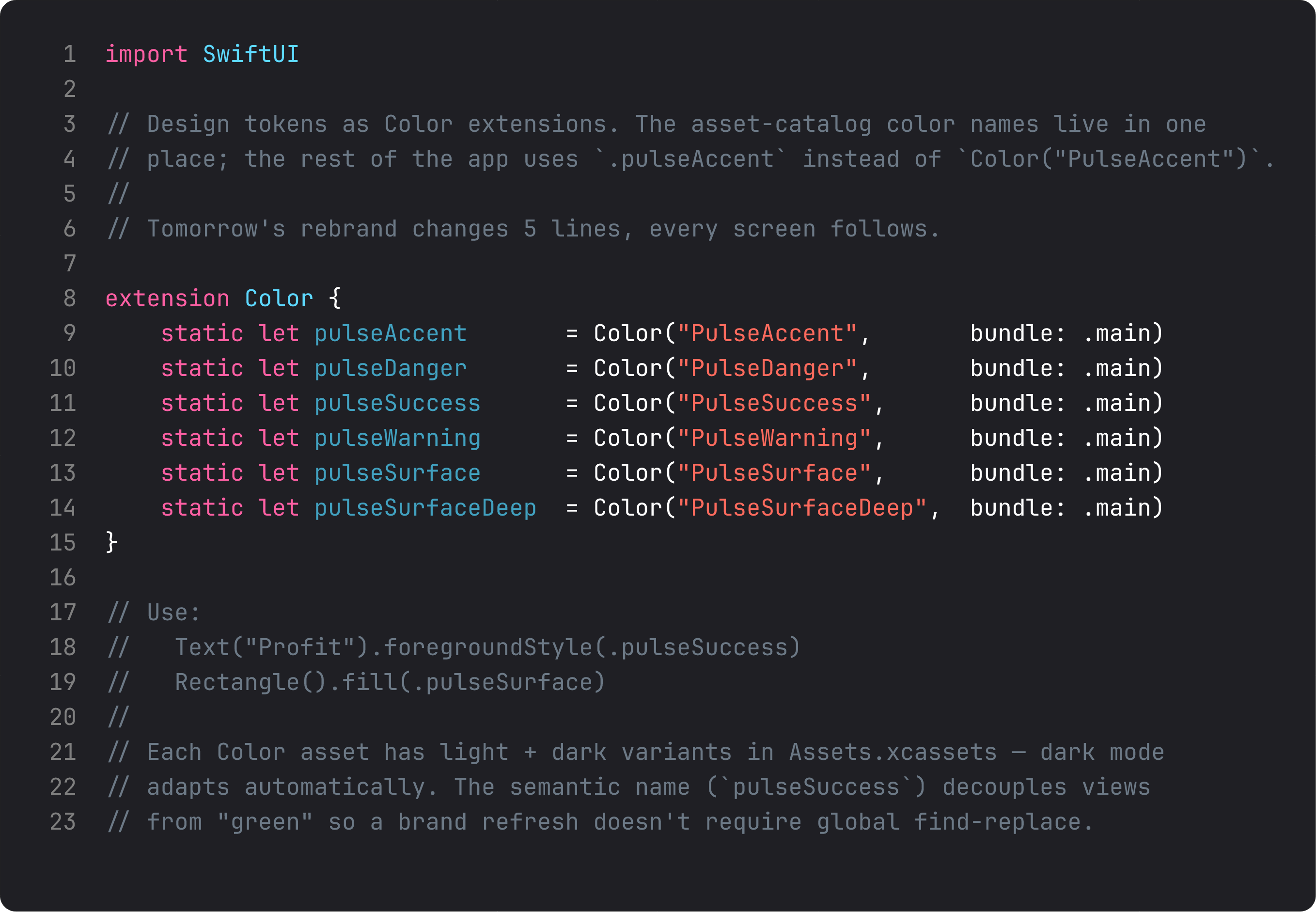
Three things this buys you:
- Decoupling from the brand.
.pulseSuccesscould be green today, teal tomorrow. The screens don’t know. - Compile-time naming. Asset-catalog typos (
Color("PulsAccent")) explode at runtime. Token names (.pulseAccent) explode at compile time — much cheaper. - Dark mode for free. Each asset has a light and dark variant. SwiftUI swaps on appearance change. Once the asset is set up, no code knows or cares.
Combine all three primitives — .pulseCard(), .pulseSoft, .pulseAccent — and a typical screen reads like a design spec instead of CSS-in-Swift. The naming is the documentation.
A trap I see weekly: over-abstracting
Don’t do this:
extension View {
    func pulsePrimaryHeading() -> some View { font(.title) }
    func pulseSecondaryHeading() -> some View { font(.title2) }
    func pulseBodyText() -> some View { font(.body) }
    // ... 30 more
}
This wraps every native SwiftUI primitive in a custom name. Looks “systemic.” Is in fact a tax — every reader has to learn your vocabulary on top of SwiftUI’s. Extract patterns that are repeated and have semantic meaning. Don’t extract single-purpose wrappers around .font(.title).
The threshold: 3+ usages with the same set of modifiers. Two usages, leave inline. Three usages, extract. The math is empirical, not philosophical.
ThinkBud ships with about 12 design-system primitives across 14 screens. Not 60. The discipline is what makes the system feel coherent — every primitive earns its place by being repeated, named, and stable.
What it looks like running
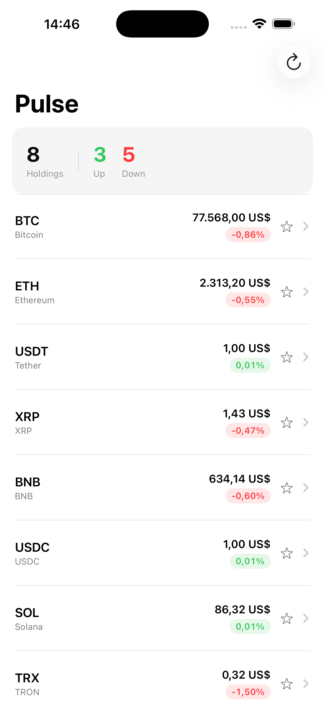
The screen looks the same. The point is what’s in the code — six places that repeated the same six modifiers now just say .pulseCard(). Add a fifteenth screen tomorrow, you don’t write the modifiers; you call .pulseCard().
Takeaway
ViewModifier for visual treatments. ButtonStyle for interactive components. Color extensions for semantic tokens. Extract patterns repeated 3+ times. Don’t wrap SwiftUI primitives that are already named well. The system pays you back the moment you add a tenth screen.
Next lesson: animations. We add a real spring to the favorite-star toggle and a matchedGeometryEffect for the price-detail transition — the polish modifiers that make Pulse feel alive instead of static.
NativeFirst Team
EditorialThe NativeFirst team — engineers and designers building native Apple apps and writing the courses we wish we had when we started.
Comments
Leave a comment