Custom Liquid Glass Components: When to Leave the Defaults (and the Three Mistakes That Kill Your Frame Rate)

Yesterday I made the case for doing almost nothing: recompile for iOS 26, spend five minutes on glassEffect for your one or two floating controls, then stop. That’s the right call for 90% of apps.
Today is about the other 10% — the moment you actually want to leave the defaults. A custom glass shape. Two glass elements that flow into each other when you tap. The stuff people screenshot and go “wait, how is that one app so smooth.”
It’s smooth because of three APIs and one container. It’s a stutter machine if you get the container wrong. I’m going to show you both, on a real iPhone 17 Pro simulator, with the same coffee-logging app — BrewLog — I used yesterday.
Let me start with the part that looks hard and isn’t.
A glass that isn’t a rectangle
Default glass takes a shape: .capsule, .rect(cornerRadius:), .circle. But the in: parameter of glassEffect(_:in:) takes any Shape. So if you want a hexagon — or a teardrop, or a chevron tab — you write the Shape and hand it over. Glass refracts along whatever edge you give it.
Here’s BrewLog’s home screen. Look at the orange “9 day streak” badge under the title: that’s a custom hexagon, not a capsule. And the blue circle bottom-right is a floating action button, collapsed.
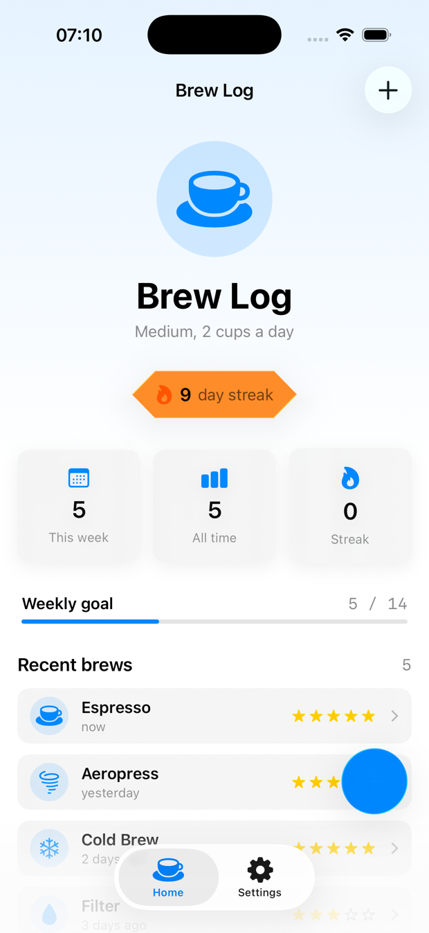
The badge is genuinely just this:
struct Hexagon: Shape {
    func path(in rect: CGRect) -> Path {
        let w = rect.width, h = rect.height
        let inset = w * 0.14
        return Path { p in
            p.move(to: CGPoint(x: inset, y: 0))
            p.addLine(to: CGPoint(x: w - inset, y: 0))
            p.addLine(to: CGPoint(x: w, y: h / 2))
            p.addLine(to: CGPoint(x: w - inset, y: h))
            p.addLine(to: CGPoint(x: inset, y: h))
            p.addLine(to: CGPoint(x: 0, y: h / 2))
            p.closeSubpath()
        }
    }
}

// then, on the badge:
.glassEffect(.regular.tint(.orange), in: Hexagon())
That’s it. A Shape you’d write for a clip path is also a glass silhouette. The only rule that bites people: give the shape a clean, closed path. Glass needs a defined edge to bend light along, and a self-intersecting or open path makes the refraction look like a smudge. Closed and convex reads best.
The tint is the other half. .regular.tint(.orange) is what makes this badge feel celebratory instead of generic — but notice I’m only tinting because the streak earned it. Which glass shows up is a decision, and we’ll test that decision in a minute. First, the fun one.
Two glass blobs that become each other
This is the move. Tap the + and it doesn’t just reveal three buttons — the single glass capsule splits into a cluster, each piece flowing out of the parent like mercury. Tap again and they pour back in.
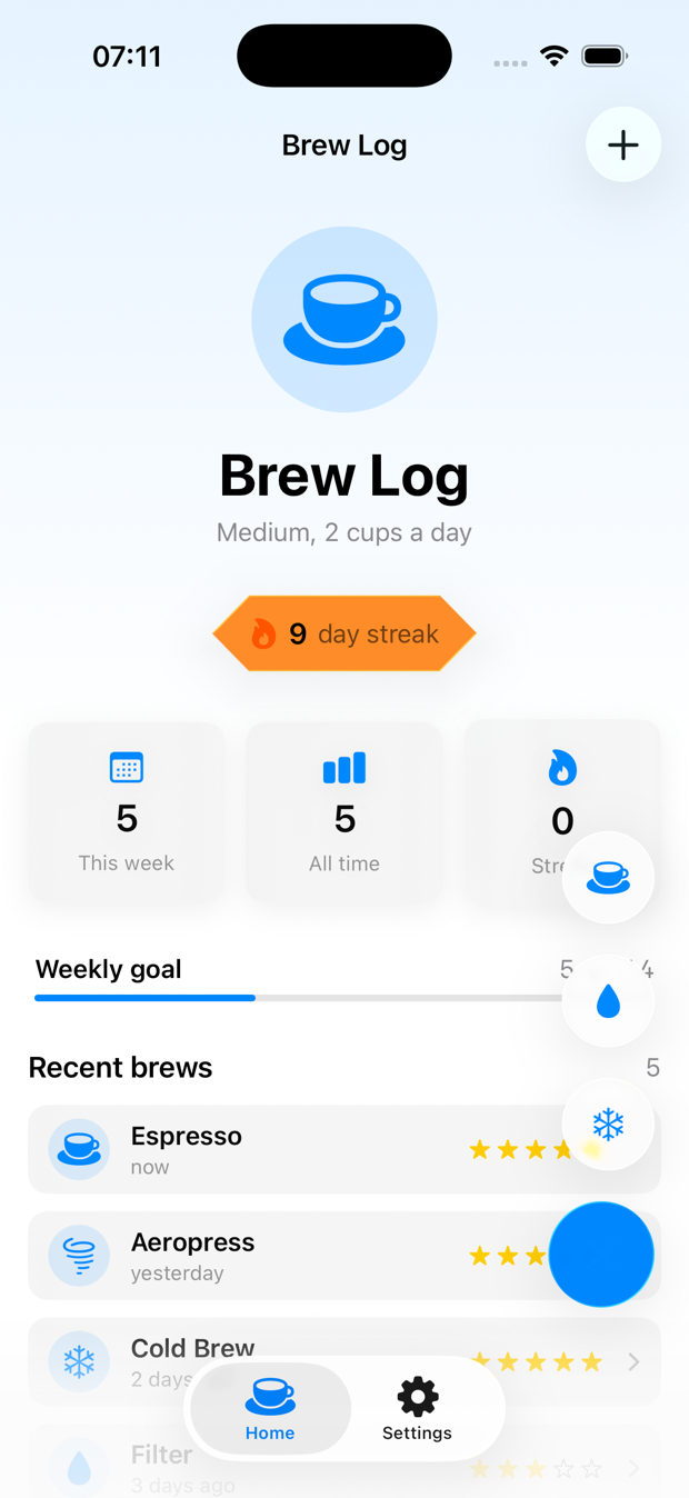
Three ingredients make that happen, and missing any one of them turns the morph into an ugly pop:
struct QuickBrewMenu: View {
    let methods: [BrewMethod]
    @Binding var isExpanded: Bool
    var onPick: (BrewMethod) -> Void

    @Namespace private var glassNS          // 1. a shared namespace

    var body: some View {
        GlassEffectContainer(spacing: 18) {  // 2. one container around all of it
            VStack(alignment: .trailing, spacing: 18) {
                if isExpanded {
                    ForEach(methods) { method in
                        Button { onPick(method) } label: {
                            Image(systemName: method.iconName)
                                .frame(width: 54, height: 54)
                        }
                        .glassEffect(.regular.interactive(), in: .circle)
                        .glassEffectID(method, in: glassNS)   // 3. a stable identity
                    }
                }

                Button {
                    withAnimation(.bouncy) { isExpanded.toggle() }
                } label: {
                    Image(systemName: isExpanded ? "xmark" : "plus")
                        .frame(width: 62, height: 62)
                }
                .glassEffect(.regular.tint(.accentColor).interactive(), in: .circle)
                .glassEffectID("fab", in: glassNS)
            }
        }
    }
}
Read those three numbered lines together, because they’re a system:
GlassEffectContaineris the stage. Every glass element inside it shares one rendering pass and can blend into the others. Without it, each.glassEffectis an island that can’t morph and pays for its own blur.@Namespaceis the shared coordinate space. It’s the same primitive asmatchedGeometryEffect— it’s how SwiftUI knows the+button and the espresso button are the same conceptual thing mid-animation.glassEffectID(_:in:)is the name tag. Give each glass a stable identity and SwiftUI can interpolate between “one capsule” and “three circles” instead of cross-fading. The parent gets an ID too ("fab"), because it’s a participant in the morph, not a bystander.
Drop any one of these and you still get buttons — they just appear with a hard cut instead of flowing. The withAnimation(.bouncy) is what gives it that liquid overshoot. .interactive() makes each one flex when you press it. None of this is more than a few lines, but the order of operations matters: container wraps namespace wraps IDs.
The three mistakes that murder your frame rate
Here’s where the “looks amazing” turns into “why is my app chugging.” Glass is expensive — it’s a live blur sampling everything behind it, recomputed as things move. The defaults are tuned to be cheap. The moment you go custom, you can wander into all three of these. I did, on purpose, so you don’t have to.
Mistake 1: glass elements without a container. This is the big one. If you scatter five .glassEffect modifiers across a view with no GlassEffectContainer, each one spins up its own offscreen blur pass. Five elements, five passes, every frame. Wrap them in a single container and it collapses to one shared pass. The container isn’t a nicety for the morph animation — it’s the single biggest performance lever you have. If you have more than one glass element near each other, they belong in a container. Full stop.
Mistake 2: glass on scrolling content. Putting .glassEffect on every row of a List or ScrollView is the classic trap. Now you’re recomputing a blur for every visible cell on every frame of the scroll, and the thing behind the glass — your own content — is also moving, so nothing can be cached. A 50-row list with glass rows will drop frames on a scroll fling. The fix is the rule from yesterday: glass is for things that float, not things that scroll. Rows stay material or solid. The floating button on top of them gets the glass. Content scrolls; chrome floats.
Mistake 3: glass behind glass behind glass. Stacking translucent glass layers means each layer samples the blurred output of the layer beneath it. Two layers is occasionally fine. Three is overdraw soup — the GPU is blurring a blur of a blur, the refraction stops meaning anything visually, and it tanks. If you catch yourself nesting glass containers, you’ve over-designed. Flatten it.
How do you know which one is biting you? You measure, the way lesson 12 of the SwiftUI at Scale course walks through: open Instruments, run the Animation Hitches template, scroll and tap the suspect screen, and watch the hitch ratio. A smooth Liquid Glass screen on an iPhone 17 Pro holds its frame budget even mid-morph — because there’s one container doing one pass. The chugging version, with glass on every row, lights up the timeline with hitches the instant you fling the list. You don’t guess which mistake you made. The timeline tells you, in the same red-bar language the concurrency posts used for thread stalls.
The fix for all three is the same instinct: fewer glass surfaces, all in one container, only on things that float.
”But how do you TDD glass?” — same answer as yesterday
You can’t write #expect(badge.looksHexagonal). The render is for your eyes and the two screenshots above. I’m not going to pretend otherwise.
But — and this is the whole Essential Developer move — the render isn’t where the bugs live. The bugs live in the decisions: which glass to show, whether to show it at all, what goes in the cluster. Those are pure functions, and pure functions are the easiest thing in the world to test. This is the exact seam from yesterday’s glassStyle function and from lesson 10 of the course: push the logic out of the view, leave the view a dumb switch, test the function.
Two real decisions in this screen. First, the streak badge. It should be hidden at zero (not an empty glass blob), neutral on a normal streak, and tinted “on fire” once you hit a week:
enum StreakGlass: Equatable {
    case hidden   // no streak yet: render nothing, not an empty glass
    case lit      // you have a streak: neutral glass
    case onFire   // a full week or more: tinted, you earned it
}

func streakGlass(streak: Int) -> StreakGlass {
    guard streak > 0 else { return .hidden }
    return streak >= 7 ? .onFire : .lit
}
The test goes first, red then green, and it pins down every boundary that’s invisible in a screenshot — the zero case, the exactly-7 edge, and the garbage-in negative:
import Testing
@testable import BrewLog

@Suite("Streak badge glass prominence")
struct StreakGlassTests {

    @Test("no streak means no badge at all — not an empty glass blob")
    func zeroStreakHidden() {
        #expect(streakGlass(streak: 0) == .hidden)
    }

    @Test("any streak below a week is lit but neutral")
    func shortStreakLit() {
        #expect(streakGlass(streak: 1) == .lit)
        #expect(streakGlass(streak: 6) == .lit)
    }

    @Test("a full week or more earns the tinted on-fire glass")
    func weekOrMoreOnFire() {
        #expect(streakGlass(streak: 7) == .onFire)
        #expect(streakGlass(streak: 30) == .onFire)
    }

    @Test("negative streaks are garbage in — never render a badge")
    func negativeStreakHidden() {
        #expect(streakGlass(streak: -3) == .hidden)
    }
}
Second decision: what goes in the cluster. The morph looks great with three blobs and turns to soup with six, so the count is a rule, not an accident — and the contents shift with the user’s milk preference. That’s testable too:
func quickAddMethods(showMilkBased: Bool) -> [BrewMethod] {
    showMilkBased
        ? [.espresso, .filter, .cold]
        : [.espresso, .aeropress, .cold]
}

@Suite("Quick-add cluster contents")
struct QuickAddMethodsTests {

    @Test("always exactly three — more than that and the morph turns to soup")
    func alwaysThree() {
        #expect(quickAddMethods(showMilkBased: true).count == 3)
        #expect(quickAddMethods(showMilkBased: false).count == 3)
    }

    @Test("espresso and cold brew are always there — the two everyone logs")
    func staplesAlwaysPresent() {
        for milk in [true, false] {
            let m = quickAddMethods(showMilkBased: milk)
            #expect(m.contains(.espresso) && m.contains(.cold))
        }
    }
}
That alwaysThree test is doing real work. It’s not checking SwiftUI — it’s enforcing a design constraint (“the cluster is capped at three so the morph stays readable”) as code. The day someone adds a fourth method and breaks the animation budget, this test goes red before the simulator ever launches. The performance rule and the test are the same rule.
And the view? Boring on purpose. It maps a tested value to a glass style and renders. There’s no logic left in it to break:
private func badge(for streak: Int) -> some View {
    switch streakGlass(streak: streak) {
    case .hidden:  AnyView(EmptyView())
    case .lit:     AnyView(StreakBadge(glass: .regular))
    case .onFire:  AnyView(StreakBadge(glass: .regular.tint(.orange)))
    }
}
All these tests passed on the same iPhone 17 Pro simulator I screenshotted, in well under a second, before I looked at a single pixel. You don’t test the glass. You test the rule that chooses the glass, and you keep the view too dumb to have a bug.
The actual decision: default or custom?
Here’s the honest line, because the whole series is about not over-building:
- Reach for custom glass when a control is special to your app and floats — a signature FAB, a custom-shaped status badge, a morphing menu. Things that earn the attention glass demands.
- Stay on the defaults for everything else. System chrome already converted for free (that was yesterday). Content stays material. You do not need a custom glass shape on a settings row.
A custom hexagon badge and a morphing FAB took maybe forty minutes including the tests. That’s the right size for a “leave the defaults” feature: one or two hero moments, contained, measured, and the rules behind them tested. Not glass on everything.
And if your app genuinely can’t take the redesign yet — a bank, an enterprise tool mid-rebrand — there’s an opt-out flag with a hard deadline attached. That’s a planning problem, not a glass problem, and I wrote it up separately: what breaks and when the grace period ends.
Tomorrow
Day 6 of the series leaves the glass surface and goes to the icon: Icon Composer and the new light / dark / clear / tinted app-icon era. I’ll take one app’s existing icon and walk it through to a complete variant set — the practical workflow, not the marketing reel.
For today: if you’ve got one control that deserves to feel special, give it a custom shape and a glassEffectID, wrap the cluster in a GlassEffectContainer, and push the “which glass when” decision into a function you can test. Then open Instruments and confirm you didn’t make mistake number one.
Custom glass on the things that float. One container. Test the decision, not the blur.
Share this post
Comments
Leave a comment
Mario
Founder & CEOFounder of NativeFirst. Building native Apple apps with SwiftUI and a passion for great user experiences.