Liquid Glass for an App You Already Shipped: What You Get From a Recompile vs. Five Lines of Tuning
Yesterday I migrated a real app to Swift 6.2 and promised you two screenshots of the same screen — one with zero code changes, one with five lines of glass. Here they are. I didn’t fake either of them. They came out of an iPhone 17 Pro simulator twenty minutes ago, from a small coffee-logging app called BrewLog that I use as a teaching project.
The reason I want to start here, instead of with the API docs, is that “adopt Liquid Glass” sounds like a project. It mostly isn’t. The biggest chunk of the visual change shows up the second you build against the iOS 26 SDK and do nothing else. The interesting decision is the small slice after that — where you spend custom-tuning time, and where you’d just be gold-plating.
So let’s measure the split honestly.
What the recompile gives you for free
This is BrewLog built against the iOS 26 SDK with not a single line of glass code. I changed the deployment target, hit ⌘B, ran it.
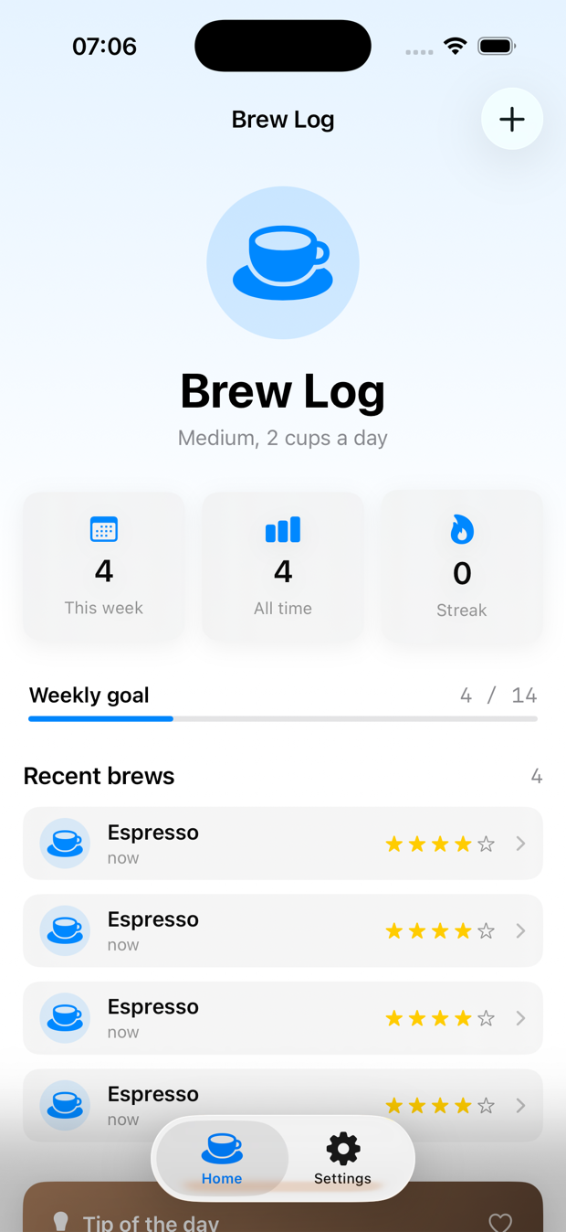
Look at the bottom. The tab bar is already a floating glass capsule that lifts off the content. Look top-right: the + button sits in its own little glass circle. I wrote none of that. The standard system containers — TabView, NavigationStack toolbars, sheets, alerts, Menu — adopt Liquid Glass automatically because they’re Apple’s views and Apple updated them.
That’s the part nobody tells you because it doesn’t make a good tutorial: if your app is built out of standard SwiftUI chrome, recompiling does 70% of the visible work. The cost is a deployment-target bump and a regression pass. No new API to learn.
The content in the middle — those stat cards, the brew rows — is still flat. Those are my views with .thinMaterial backgrounds. The system can’t glassify what it doesn’t own. Which brings us to the 30%.
What five lines of tuning actually changes
Same screen. Two real edits. Here’s the after:
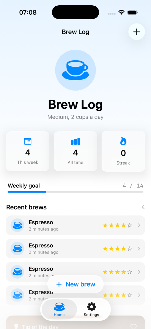
The stat cards read as glass now, and there’s a floating “New brew” capsule sitting over the list, bending the row behind it like a real lens. That’s the Liquid Glass look — the thing people screenshot. It took two changes.
Edit one — the stat cards. I swapped the material background for glassEffect. Literally one line per card:
// Before
.background(.thinMaterial, in: .rect(cornerRadius: 12))

// After
.glassEffect(.regular, in: .rect(cornerRadius: 12))
glassEffect(_:in:) takes a Glass value (.regular is the default) and a shape. That’s it. The shape matters — glass needs a defined edge to refract along, so always give it one rather than letting it guess.
Edit two — the floating button. This is the marquee move, and it’s the one worth understanding:
.overlay(alignment: .bottom) {
    GlassEffectContainer(spacing: 16) {
        Button {
            isComposing = true
        } label: {
            Label("New brew", systemImage: "plus")
                .font(.headline)
                .foregroundStyle(.tint)
                .padding(.horizontal, 22)
                .padding(.vertical, 14)
        }
        .glassEffect(.regular.interactive(), in: .capsule)
    }
    .padding(.bottom, 12)
}
Two details earn their keep here. .interactive() tells the glass to react to touch — it flexes and brightens when pressed, the way the system controls do. And GlassEffectContainer is the one piece people skip and then wonder why their app stutters: it lets multiple glass elements share a single rendering pass and morph into each other instead of each spawning its own expensive blur. If you have one floating control today, the container costs you nothing. The day you add a second, it’s the difference between a smooth morph and a frame drop. Wrap your glass in a container from the start and you never have to retrofit it.
That’s the whole diff. One line on the cards, a small overlay for the button. The difference between the two screenshots is maybe five minutes of work.
The honest part: where to stop
Here’s where I disagree with most of the hype. After those two edits, BrewLog looks like an iOS 26 app. The temptation now is to go glass-everything — glass on every row, glass section headers, tinted glass behind the hero. Don’t.
Liquid Glass is a focus material. It’s meant for the controls that float above your content — toolbars, action buttons, the chrome. The moment you put glass behind glass behind glass, you get visual soup and the refraction stops meaning anything, because everything is competing to be the foreground. The content underneath — your actual app — should mostly stay opaque and calm so the glass has something to refract.
My rule after shipping a few of these: glass goes on things that float and respond to touch. Everything that’s just content stays material or solid. The recompile handles the floating system chrome. You handle the one or two custom floating controls that are special to your app. Then you stop.
If you want the deeper version of “when does glass help vs. hurt,” that’s tomorrow’s post. Today the takeaway is the budget: recompile for the 70%, spend five minutes on the 30% that’s yours, resist the urge to spend an hour gold-plating the part that should’ve stayed flat.
”But how do you TDD a thing you can only see?”
Fair question, and I’m not going to pretend you can write #expect(view.looksGlassy == true). You can’t unit-test a blur. A glass render is a job for your eyes and the two screenshots above, full stop.
But that’s not where the bugs live. The bugs live in the decision about which glass to show. And decisions are pure functions, and pure functions are the easiest thing in the world to test — which is exactly the seam I teach in lesson 10 of the SwiftUI at Scale course: push the geometry and the logic out of the view, leave the view a dumb switch, and test the function.
Concrete example. I want the weekly-goal card to get a celebratory tinted glass once you actually hit your goal, and stay neutral before that. The view shouldn’t own that rule. A function should:
enum BrewGlass: Equatable {
    case neutral       // plain regular glass
    case celebratory   // accent-tinted, you earned it
}

func glassStyle(weekCount: Int, goal: Int) -> BrewGlass {
    guard goal > 0 else { return .neutral }
    return weekCount >= goal ? .celebratory : .neutral
}
Now the test goes first, the way it should. This is the same red-green rhythm from the concurrency migration yesterday — write the expectation, then make it pass:
import Testing
@testable import BrewLog

@Suite("Goal-card glass prominence")
struct BrewGlassTests {

    @Test("neutral while you're still short of the goal")
    func neutralBelowGoal() {
        #expect(glassStyle(weekCount: 6,  goal: 14) == .neutral)
        #expect(glassStyle(weekCount: 13, goal: 14) == .neutral)
    }

    @Test("celebratory the moment you hit it, and beyond")
    func celebratoryAtAndAboveGoal() {
        #expect(glassStyle(weekCount: 14, goal: 14) == .celebratory)
        #expect(glassStyle(weekCount: 20, goal: 14) == .celebratory)
    }

    @Test("a zero or unset goal never celebrates — no divide-by-zero, no surprise tint")
    func zeroGoalStaysNeutral() {
        #expect(glassStyle(weekCount: 5, goal: 0) == .neutral)
    }
}
The boundary at exactly weekCount == goal is the kind of off-by-one that’s invisible in a screenshot and obvious in a test. Is it celebratory at 14, or only at 15? You decide that in the test, not by squinting at the simulator and guessing.
And the view? The view is now boring on purpose:
private var goalGlass: Glass {
    switch glassStyle(weekCount: weekCount, goal: prefs.weeklyGoal) {
    case .neutral:     .regular
    case .celebratory: .regular.tint(.accentColor)
    }
}

// ...
.glassEffect(goalGlass, in: .rect(cornerRadius: 16))
The view maps a tested value to a glass style and renders. There’s no logic left in it to break. That’s the whole Essential Developer move applied to a visual feature: you don’t test the pixels, you test the rule that chooses the pixels, and you keep the view too dumb to have a bug.
Three tests, maybe four minutes. They’ll outlive every redesign Apple ships, because the rule (“celebrate when you hit your goal”) doesn’t change even when the material does.
The checklist, because that’s the actually useful part
If you’re staring at an app you shipped last year and wondering what “adopt Liquid Glass” costs you, here’s the path that worked:
- Bump the deployment target, build against the iOS 26 SDK, run it. Don’t write any glass code yet. Just look.
- Screenshot the result. That’s your free 70% — the system chrome already converted. Note what still looks flat.
- Find your one or two custom floating controls. A FAB, a custom toolbar, an overlay HUD. Those are the glass candidates.
- Swap their backgrounds for
.glassEffect(.regular, in: someShape). Give every glass a defined shape. - Wrap them in a
GlassEffectContainernow, even if there’s only one. It’s free today and saves a refactor the day you add a second. - Add
.interactive()to the ones you tap. That’s the flex-on-press feel for free. - Stop. Content stays opaque. Glass is for things that float.
- Extract any “which glass when” rule into a function and test it. The render is for your eyes; the decision is for
#expect.
That’s a one-evening job for a normal app, and most of the evening is the regression pass in step 2, not the glass in steps 4–6.
One caveat worth your attention: this is the opt-in story, for apps that want the new look. There’s also an opt-out flag for apps that genuinely can’t ship a redesign yet — banking, enterprise, anything mid-redesign — and a hard deadline attached to it. I wrote up what actually breaks and when the grace period ends separately, because that’s a planning problem, not a glass problem.
Tomorrow
Day 5 of the series is the other half of this: custom Liquid Glass components, and when it’s worth leaving the defaults. We’ll do glassEffect(in:) with a custom shape, layer two glass elements so they morph into each other with glassEffectID, and — the part that actually matters — I’ll show you the three mistakes that turn buttery glass into a frame-drop machine, measured in Instruments the way lesson 12 of the course does it. Not vibes. Numbers.
For today: open the app you already shipped, change the deployment target, and just look at it before you write a line of code. You’ve probably already done most of the work and didn’t know it.
Recompile for the 70%. Five lines for the 30%. Don’t pay for the part that should’ve stayed flat.
Share this post
Comments
Leave a comment
Mario
Founder & CEOFounder of NativeFirst. Building native Apple apps with SwiftUI and a passion for great user experiences.